Stanislaus
The Tomatoes Behind the
Best Slice in Town
For more than 80 years, Stanislaus has supplied the tomatoes behind America's best independent pizzerias and Italian restaurants. Built on real Italian family values and a relentless commitment to quality, they've earned deep loyalty from the restaurateurs who swear by their products. And a portfolio this rich deserved a story just as strong—one that was easier to navigate, easier to tell, and worthy of the quality reputation they'd earned. We partnered with Stanislaus as their CPG creative agency to untangle a complex product lineup, sharpen the brand narrative, modernize packaging across four tiers, rebuild their digital presence, and create a content library that finally does justice to the Cortopassi family legacy and the premium tomatoes found in every can.
Client
Stanislaus
Services
- Packaging
- Digital
BRANDING
Strategy
Every great brand starts with clarity. We helped the Stanislaus team organize a decades-old portfolio into four distinct tiers—each with a defined role and reason for being. From there, we surfaced what makes Stanislaus genuinely irreplaceable: tomatoes packed within six hours of harvest, never from concentrate, by a family that has never once compromised on quality. That strategic clarity became the foundation for a cohesive visual system and logomark structure built to scale across the full portfolio.

PACKAGING
An Evolution and a Revolution
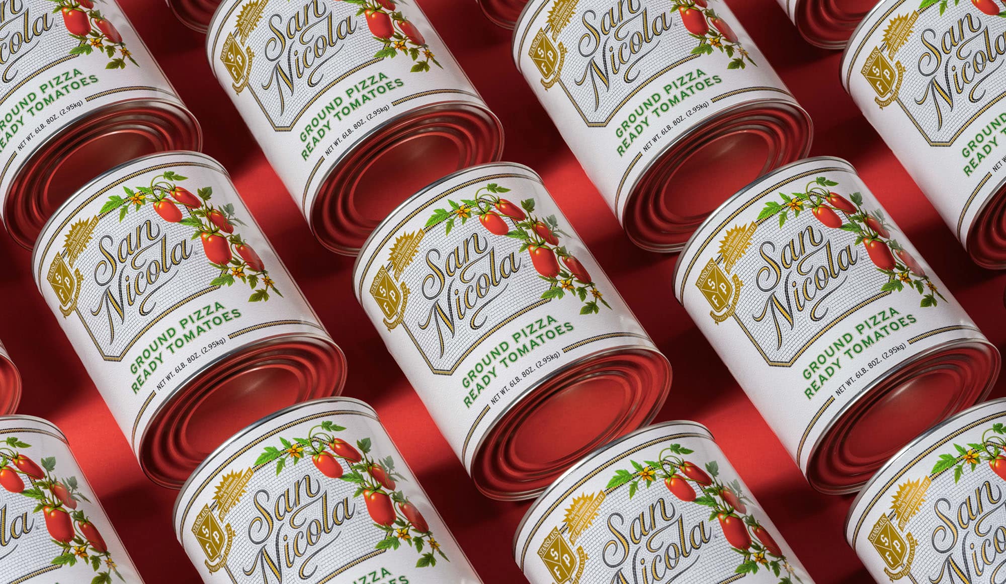
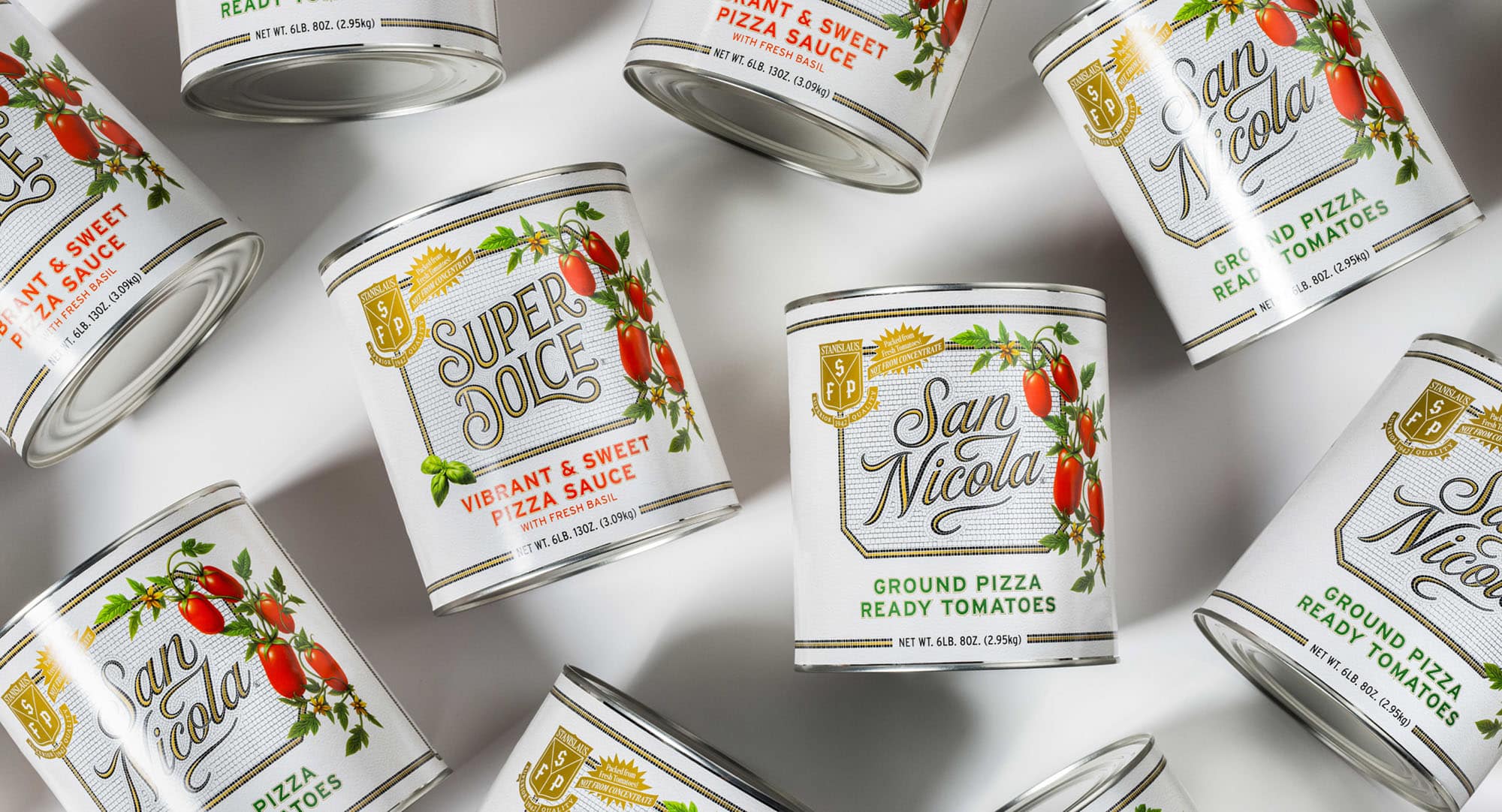
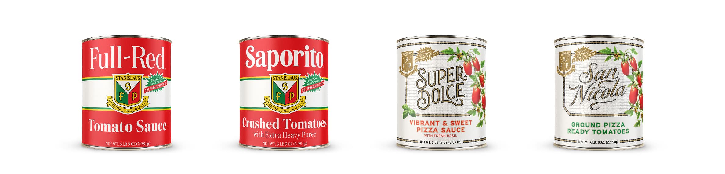
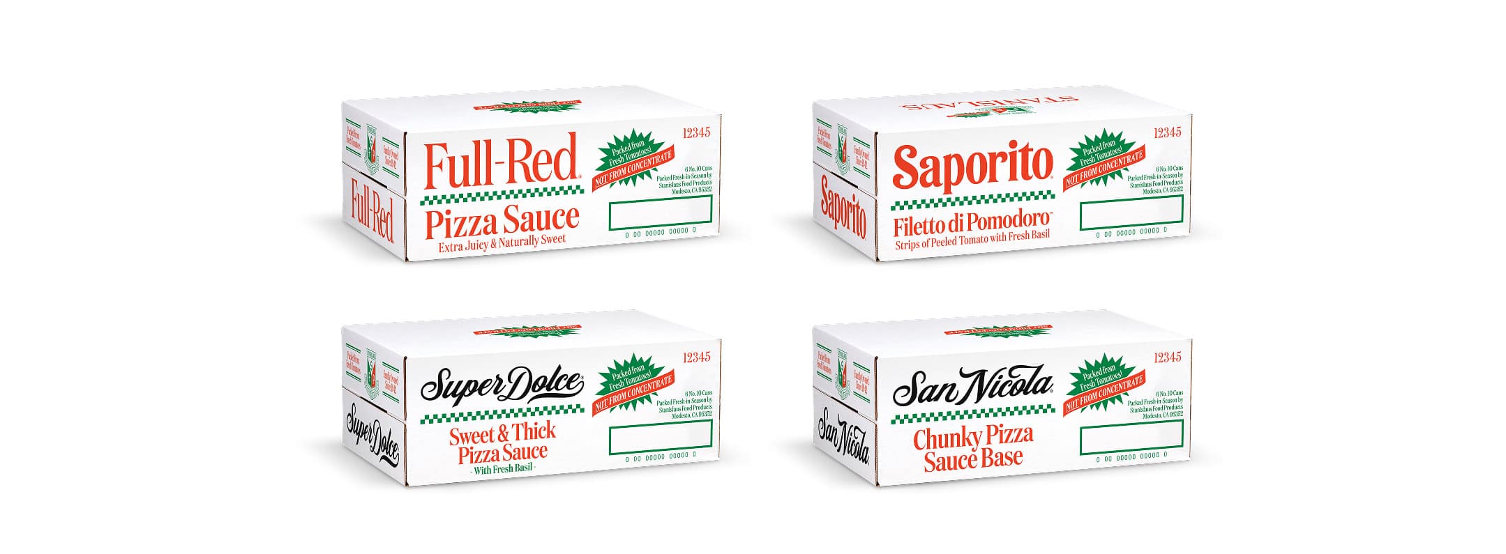
For Full-Red and Saporito—the flagship product lines that restaurateurs rely on—we took an evolution approach: sharpening typography, refining hierarchy, and elevating the iconic shield without disrupting the equity already built. For San Nicola and Super Dolce, we went further. These innovative products had long been favorites among the Stanislaus team but were lost in the lineup. They deserved a packaging revolution—custom script typography, botanical illustration, and a mosaic-inspired aesthetic that gave two outstanding products a package that was worthy of their reputation.
Digital
Web Design
The old Stanislaus website read like a product catalog—static, hard to navigate, and disconnected from the brand's rich story. We rebuilt it from the ground up: restructuring navigation around the product portfolio, elevating the company’s heritage story, telling the harvest-to-can story in a way that resonates with independent restaurateurs, and bringing the refreshed visual identity to life at every touchpoint. The result is a site that builds trust and communicates quality before a restaurateur ever opens a can.
Content
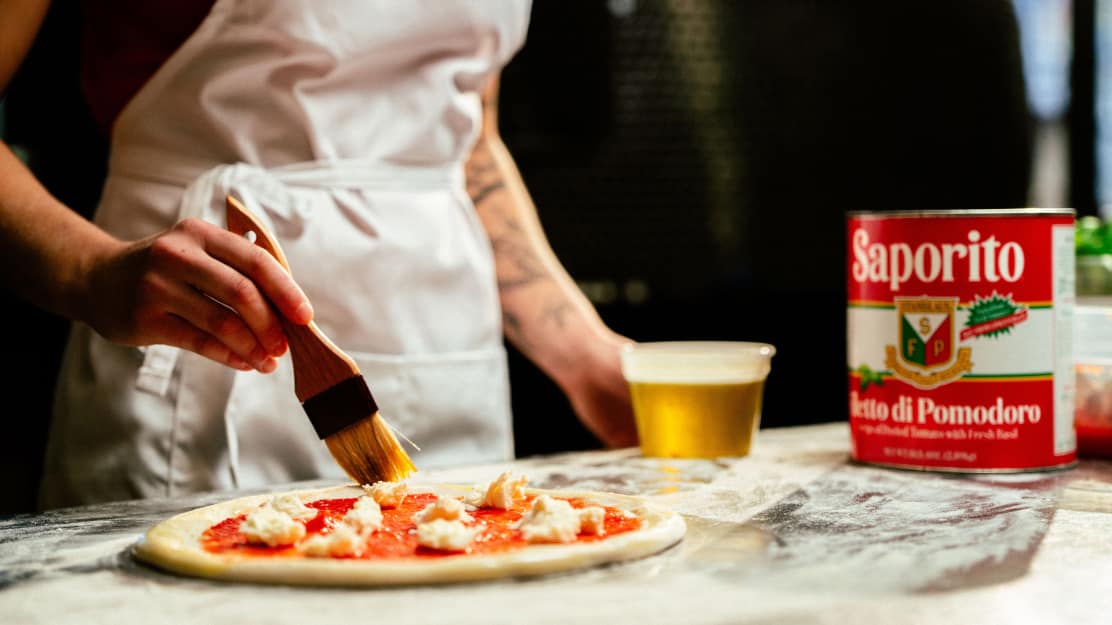
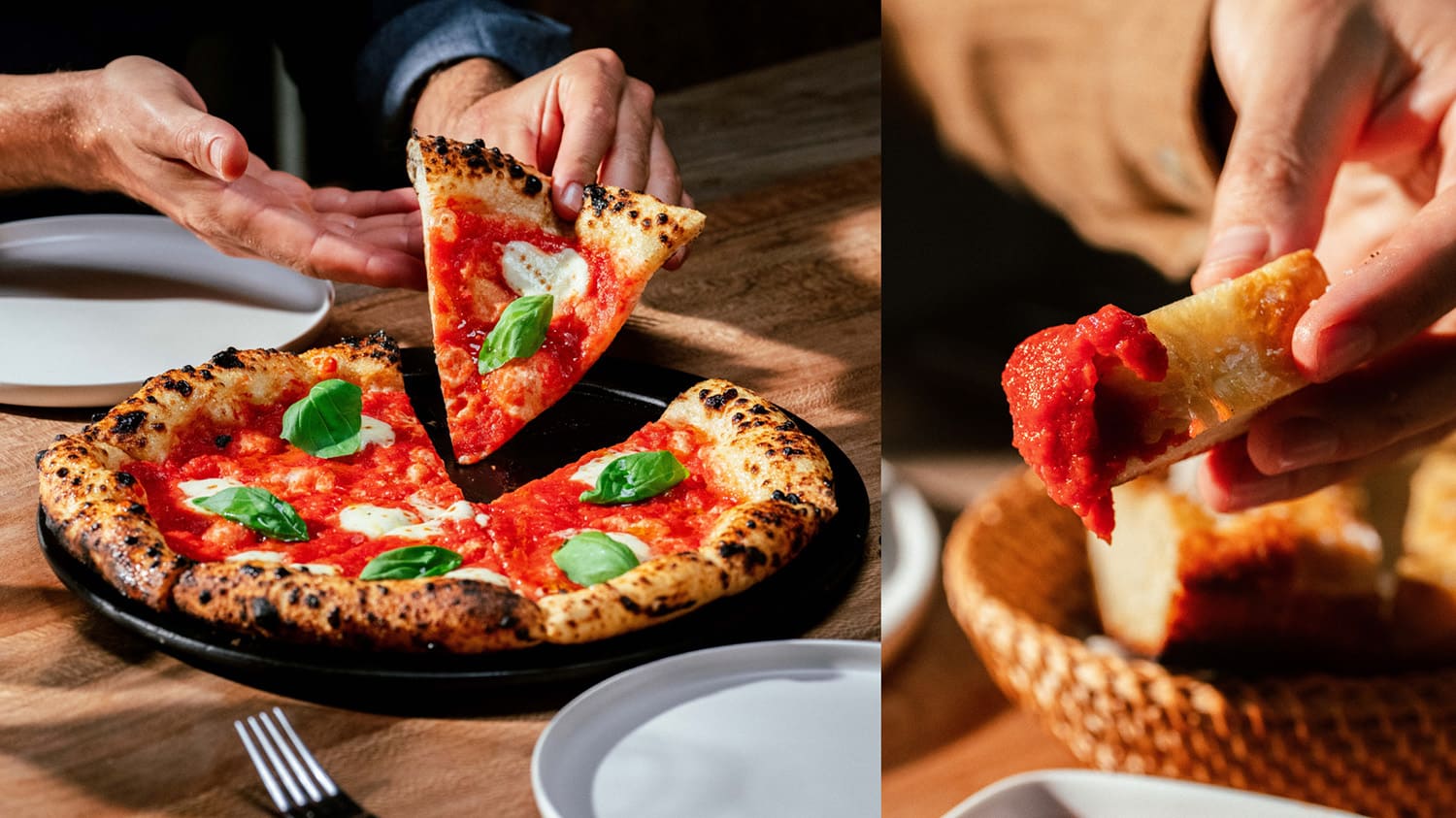
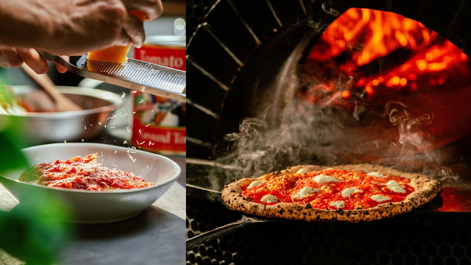
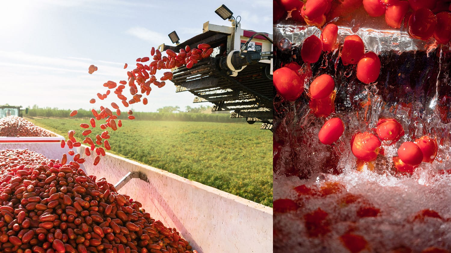
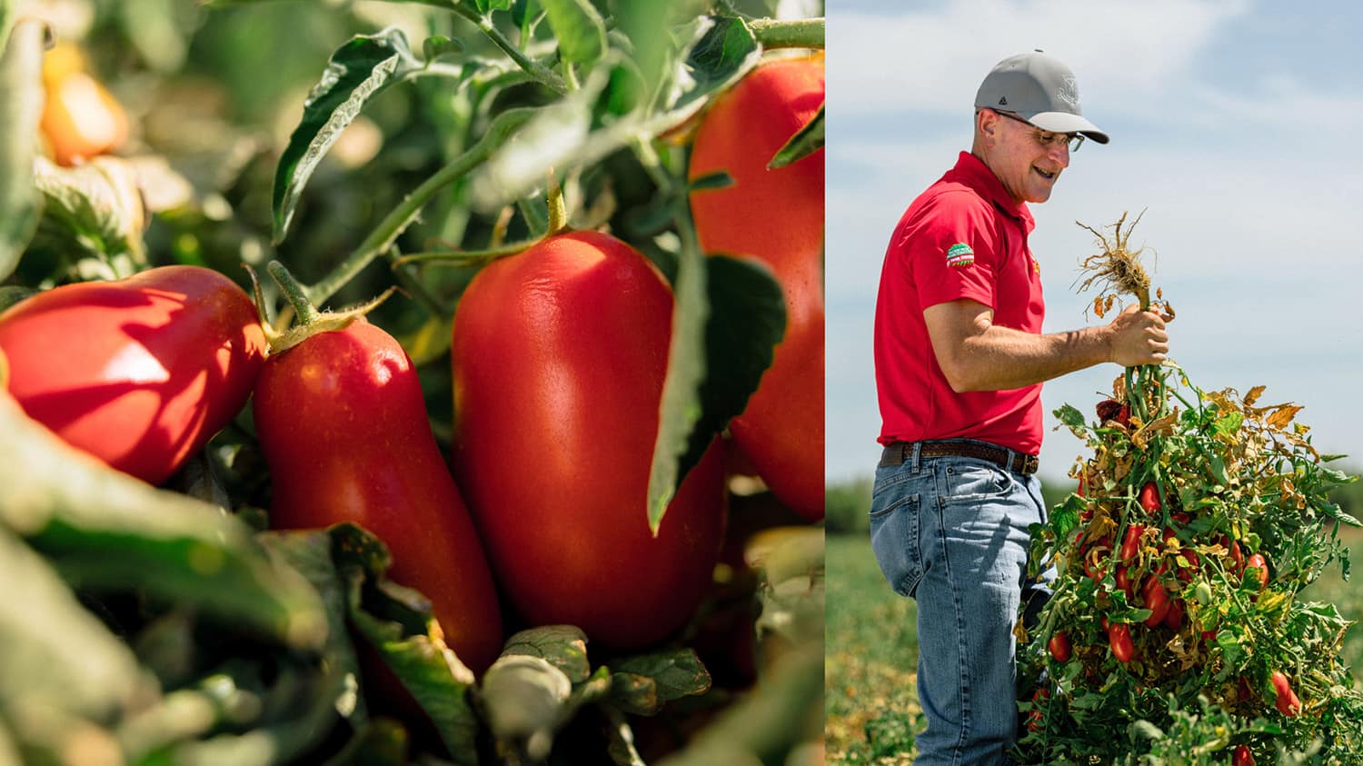
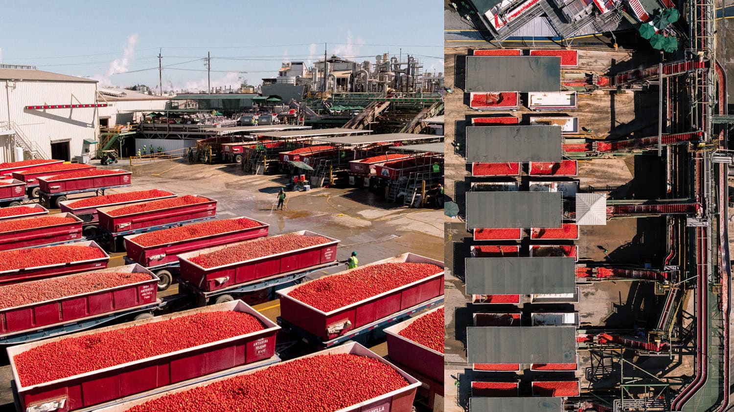
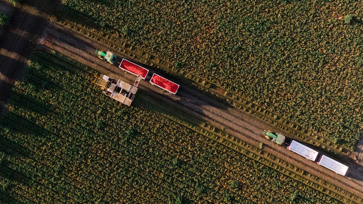
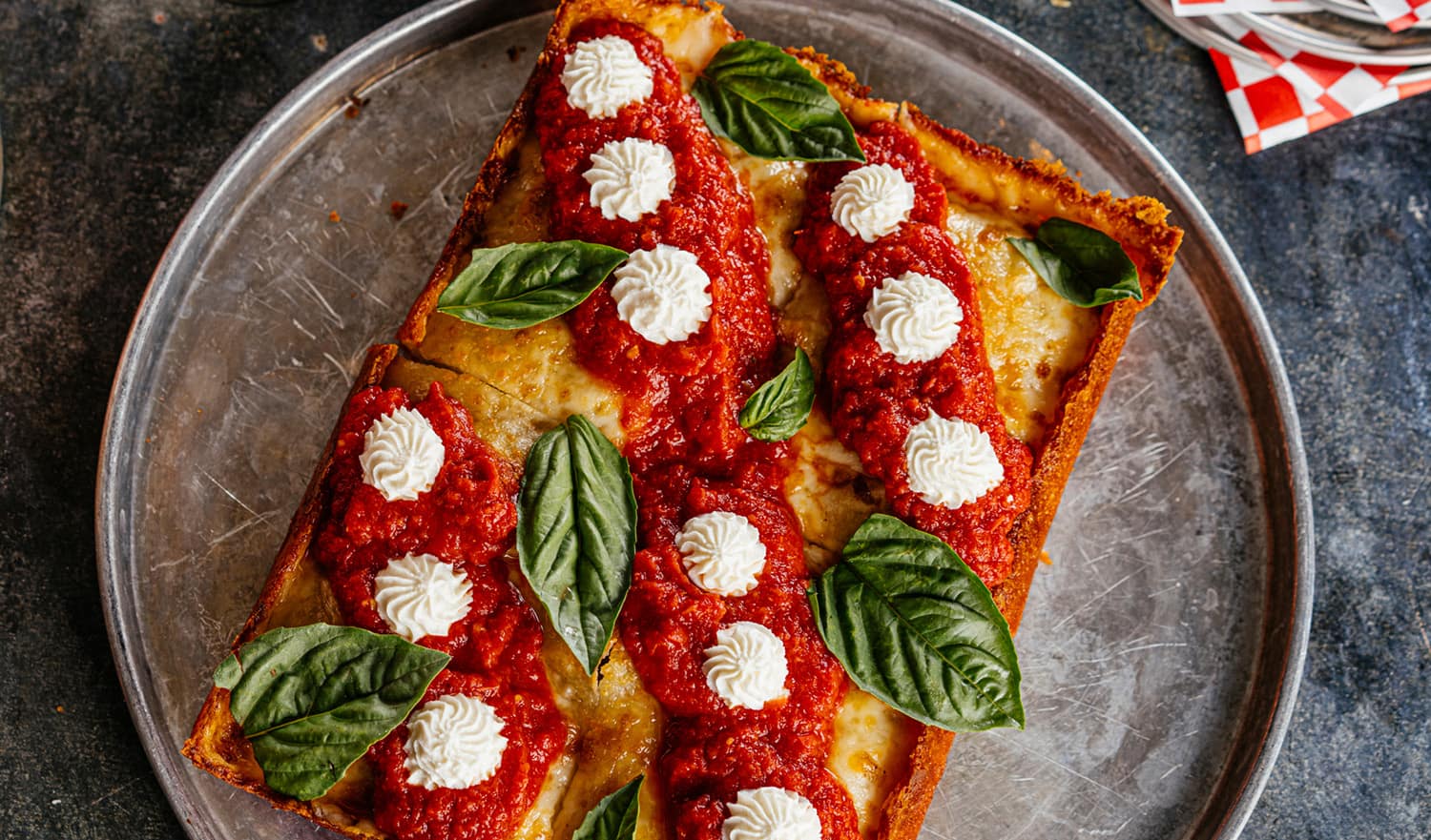
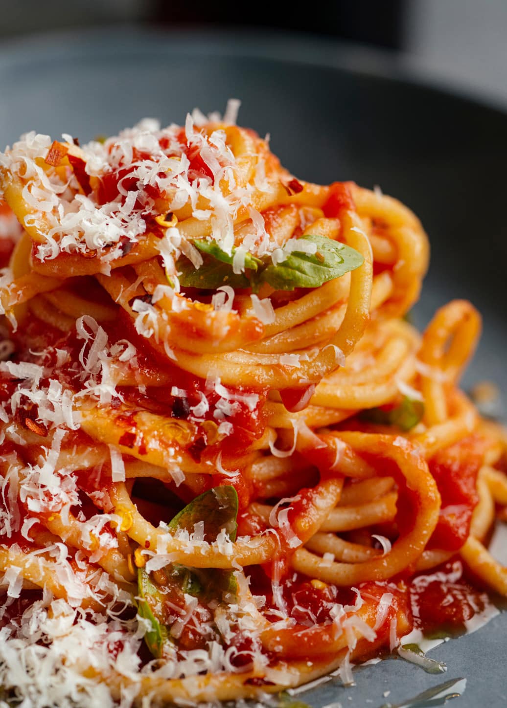
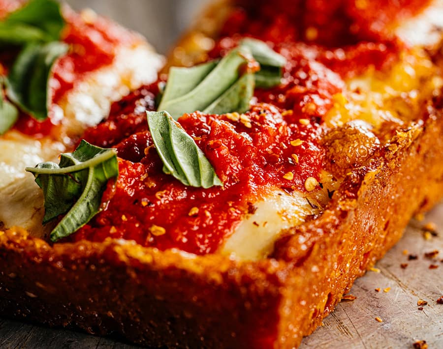
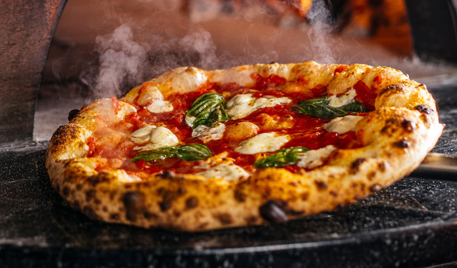
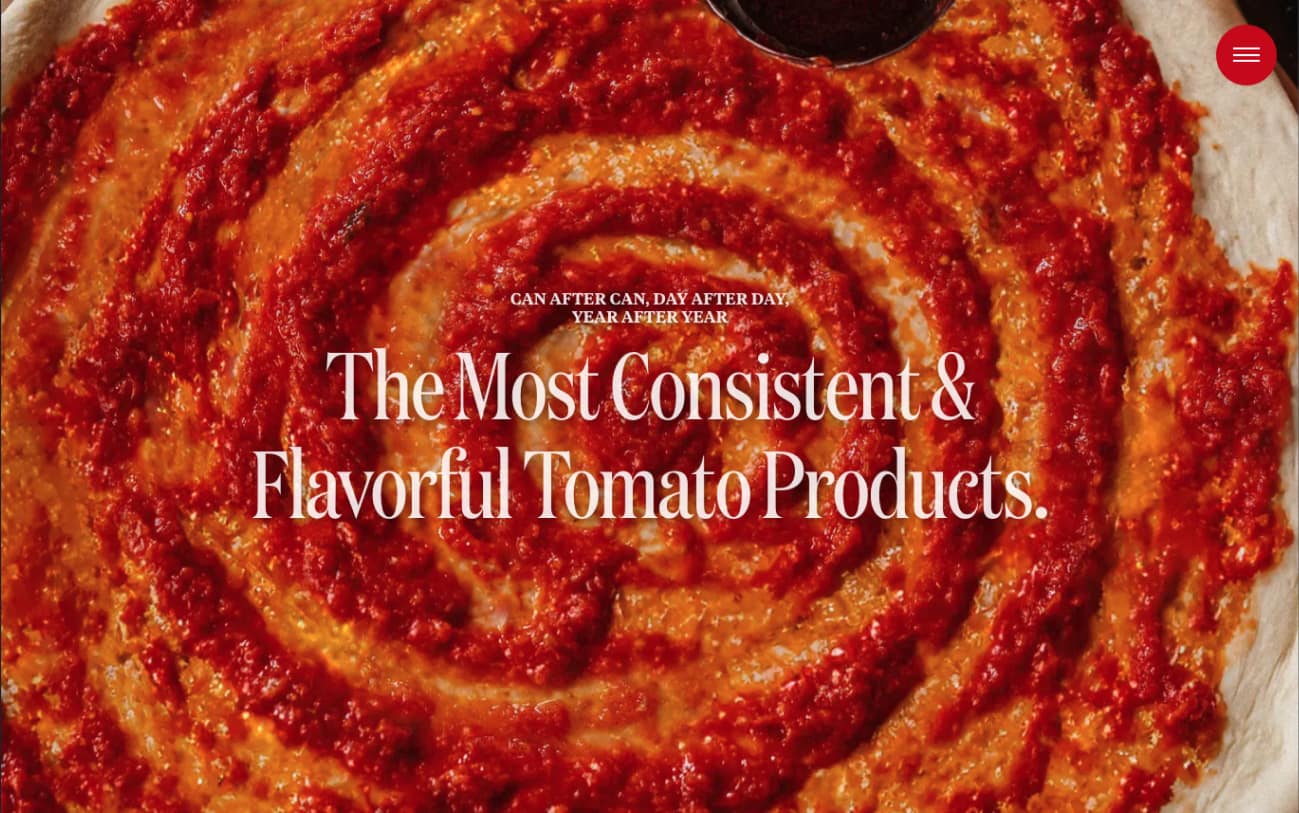
Photo & Video
Great packaging and a great website only go as far as the imagery that fuels them. We art directed and produced a comprehensive photography and videography library spanning three story territories—California agriculture and harvest, the production process, and the act of using the product in real restaurant environments. The priority was taste appeal: images that communicate quality before a single word is read (and led to quite a few midday pizza runs among our team). The result is a flexible content library that works across packaging, digital, and every channel in between.