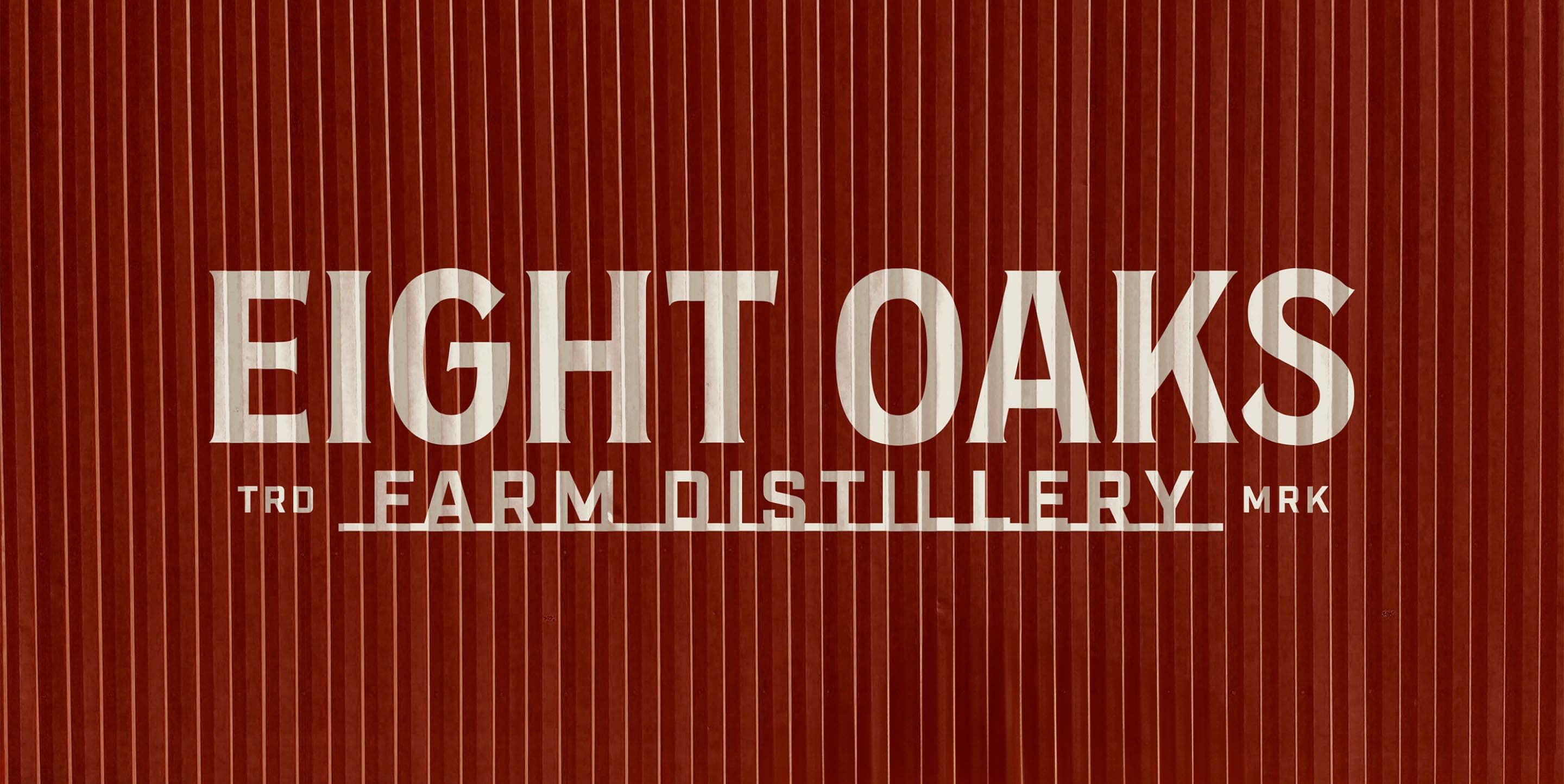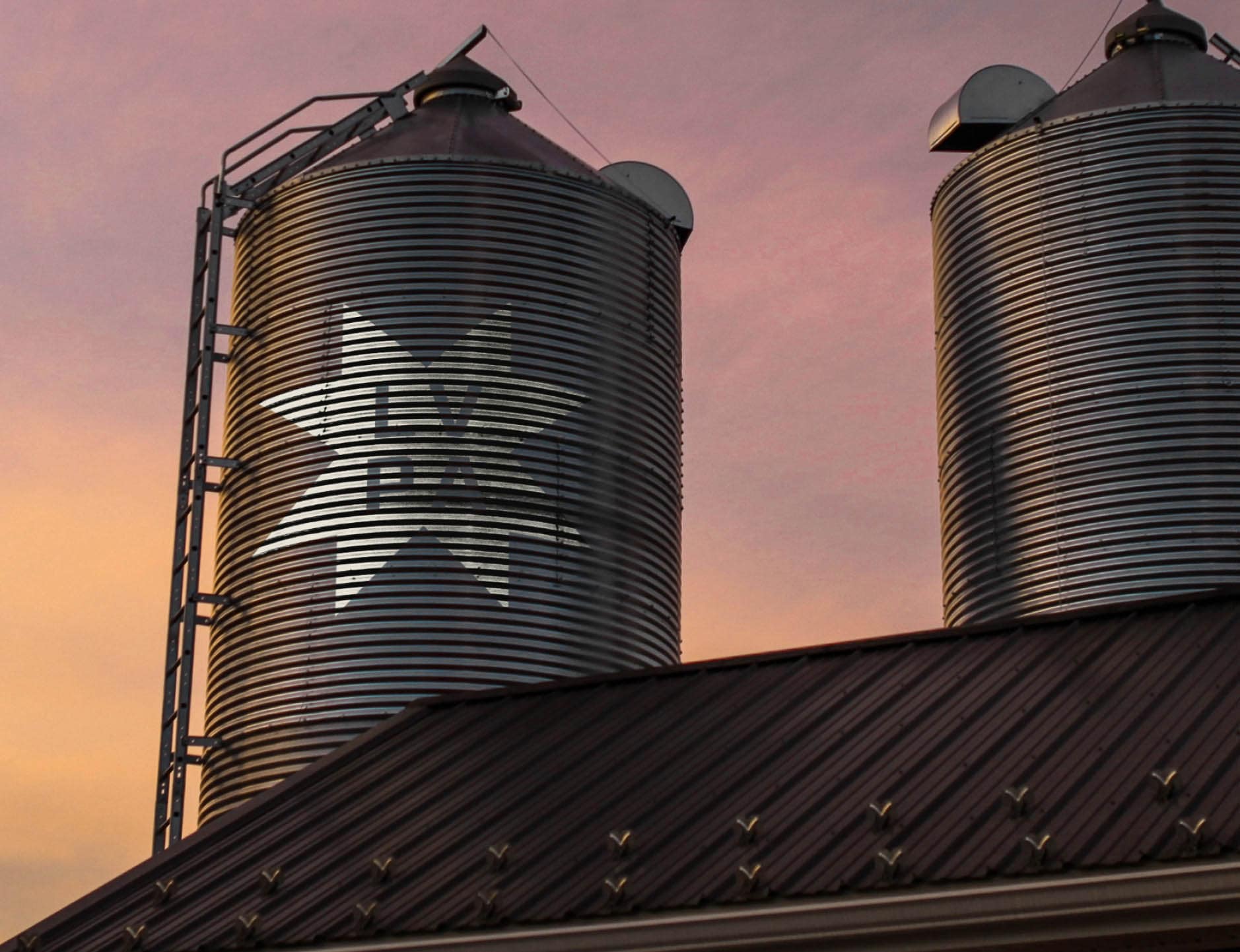
Eight Oaks Farm Distillery
We Grow What We Drink.
Every great brand starts with a powerful idea—and for Eight Oaks, that began with creating clarity at the core. Through in-depth discovery and brand strategy, we uncovered their defining truth: We Grow What We Drink. More than a tagline, it became the big brand idea behind a complete transformation. From bespoke glass bottles inspired by Pennsylvania’s steel-town grit to a packaging system spanning multiple product tiers and SKUs, every element was designed to elevate brand distinction and drive shelf recognition. The rebrand also laid the foundation for product innovation, including a new line of RTD cocktails that quickly became one of their fastest-growing categories. Fueled by national awards and a deepened connection to their community, Eight Oaks is now on a new growth trajectory—scaling with purpose, and with a brand as intentional and authentic as the spirits they craft.
Read MoreClient
Eight Oaks Farm Distillery
Services
- Branding
- Packaging
- Digital
Awards & Recognition


Branding
Strategy & Identity
We began with a comprehensive brand strategy, working directly with the Eight Oaks team to adjust their market positioning and product offerings by evaluating their target consumers, local and national competitors, and category trends. From there, we built a brand story and identity that could convey their rich and layered narrative in an impactful way, addressing audiences ranging from consumers to trade. By starting with a strategic vision, we identified key elements to tell their unique story succinctly yet compellingly—from a meaningfully designed suite of logomarks, a visual definition of their brand philosophy's interconnected ecosystem, and key messaging incorporated into their packaging design.
Read More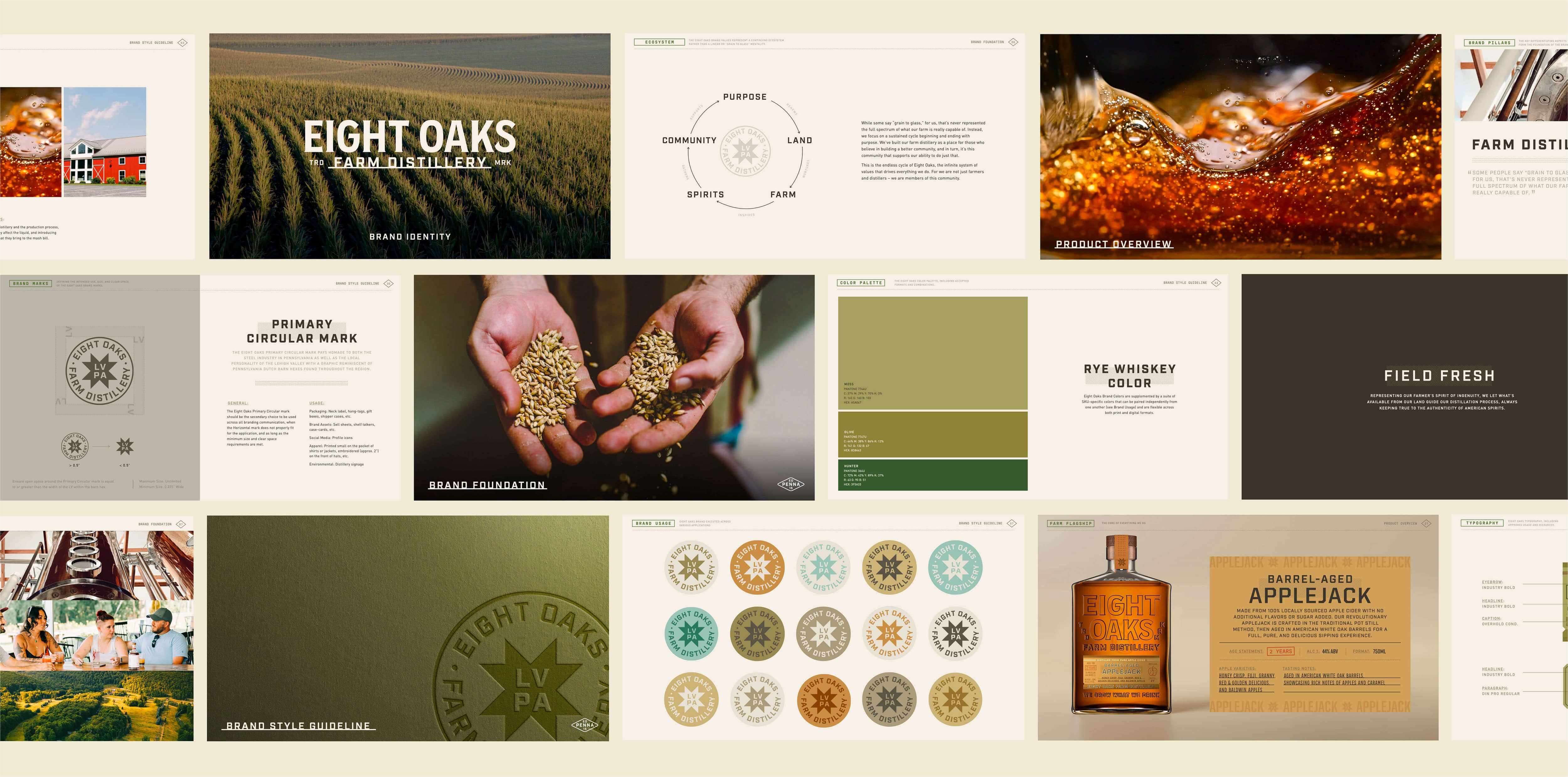

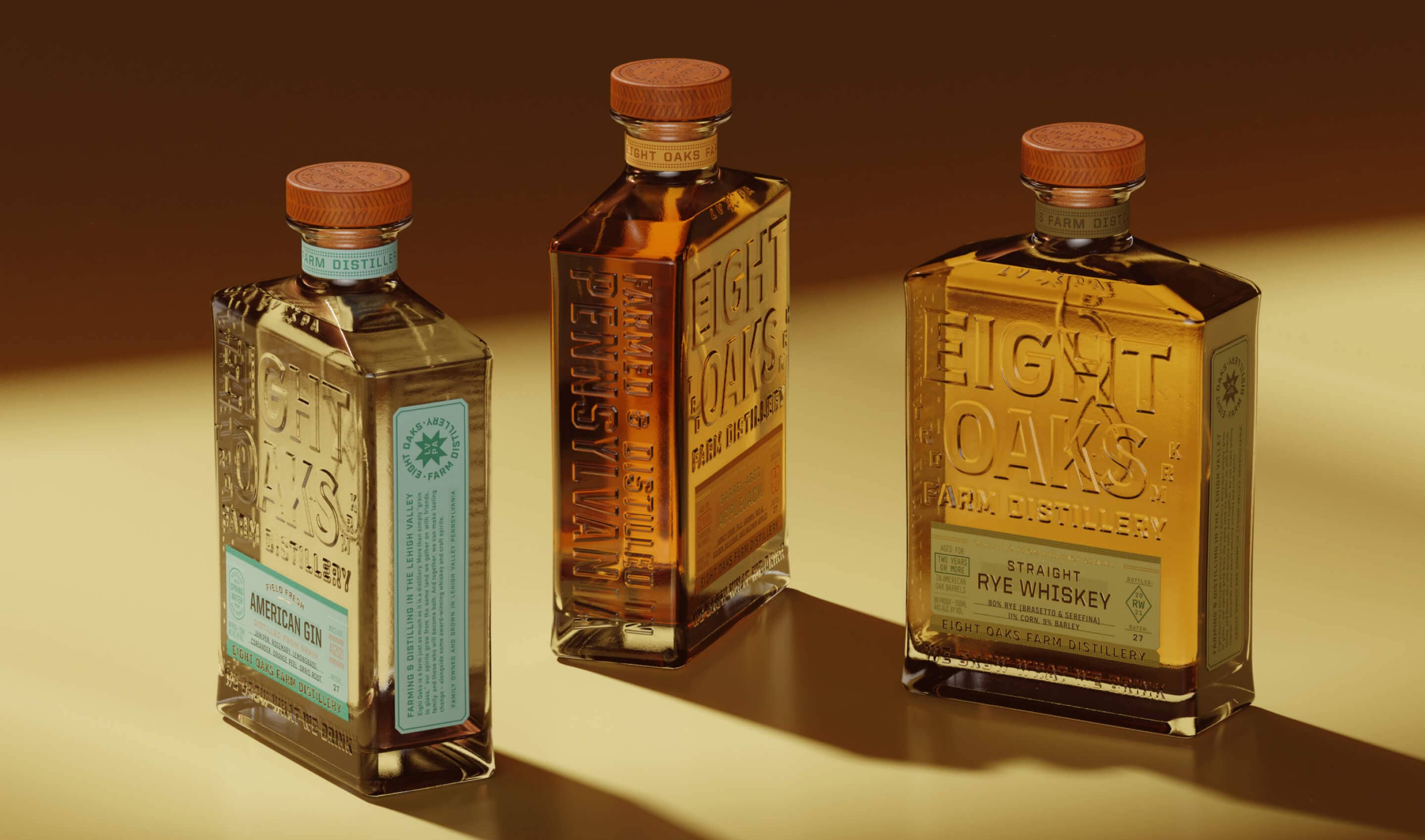
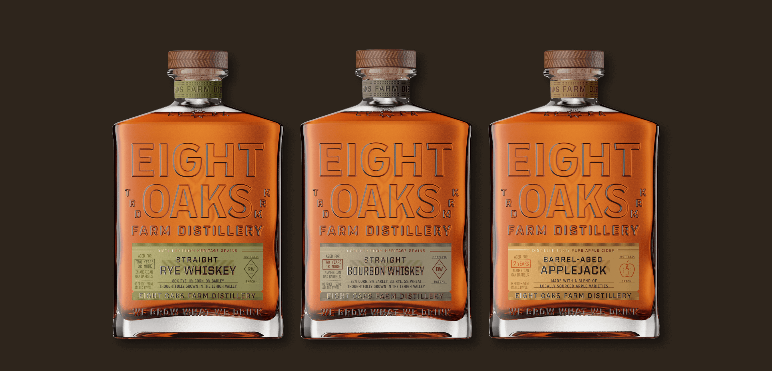
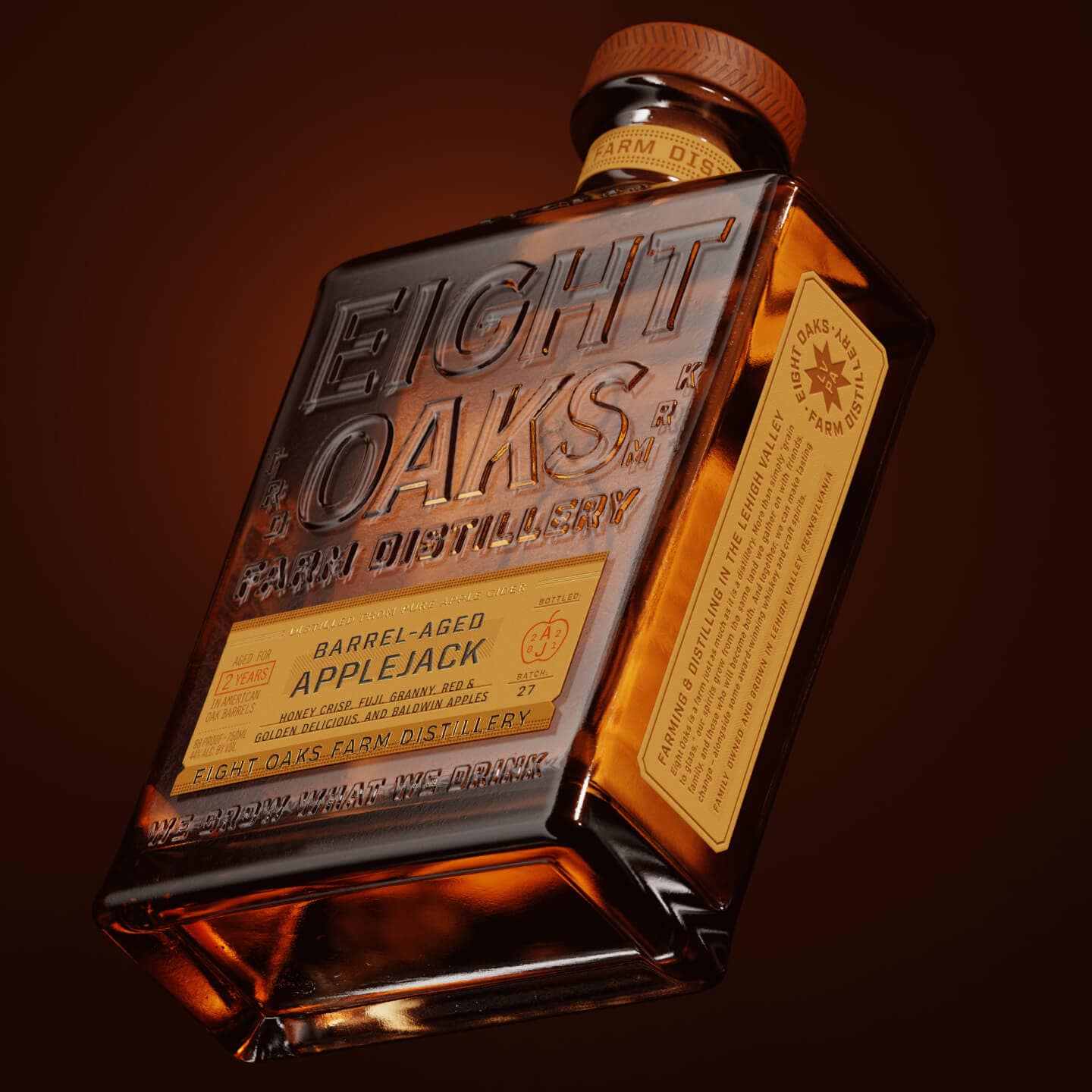
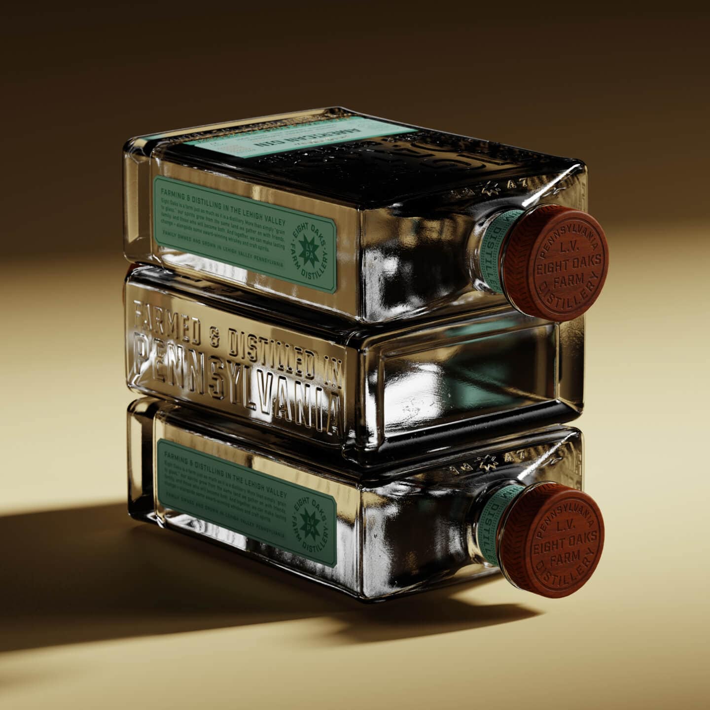
Packaging
Product Design
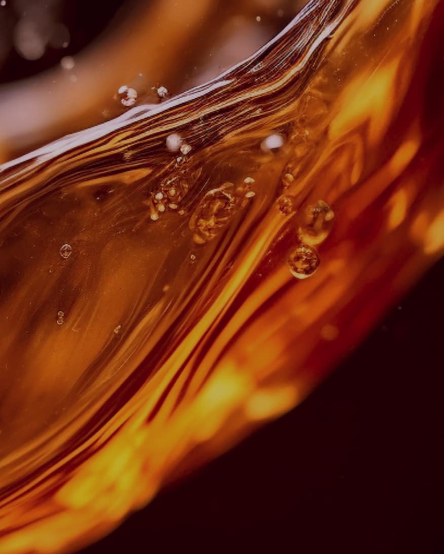
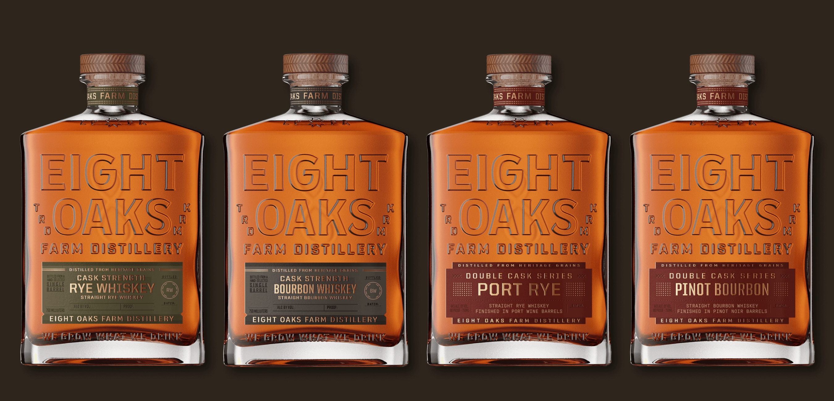
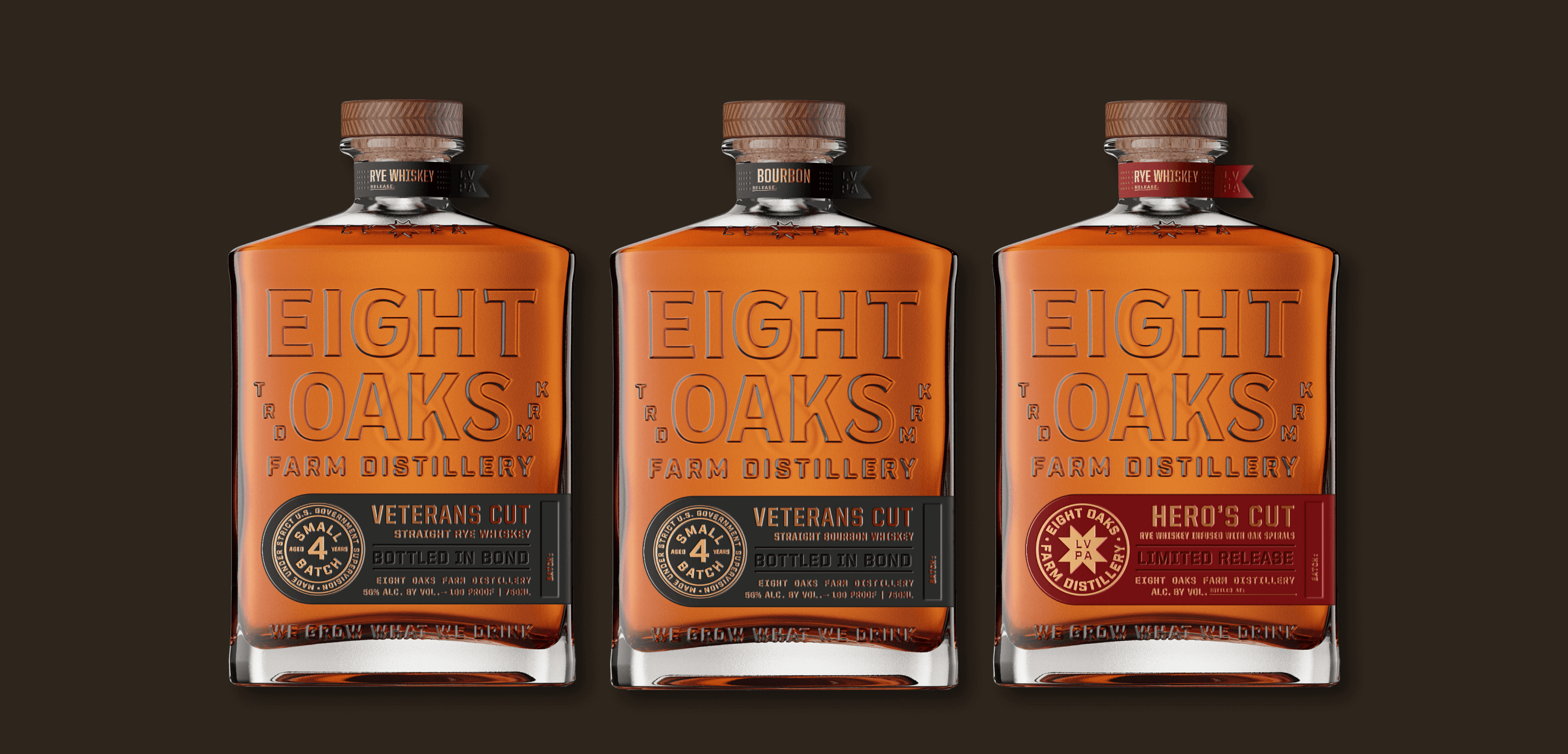
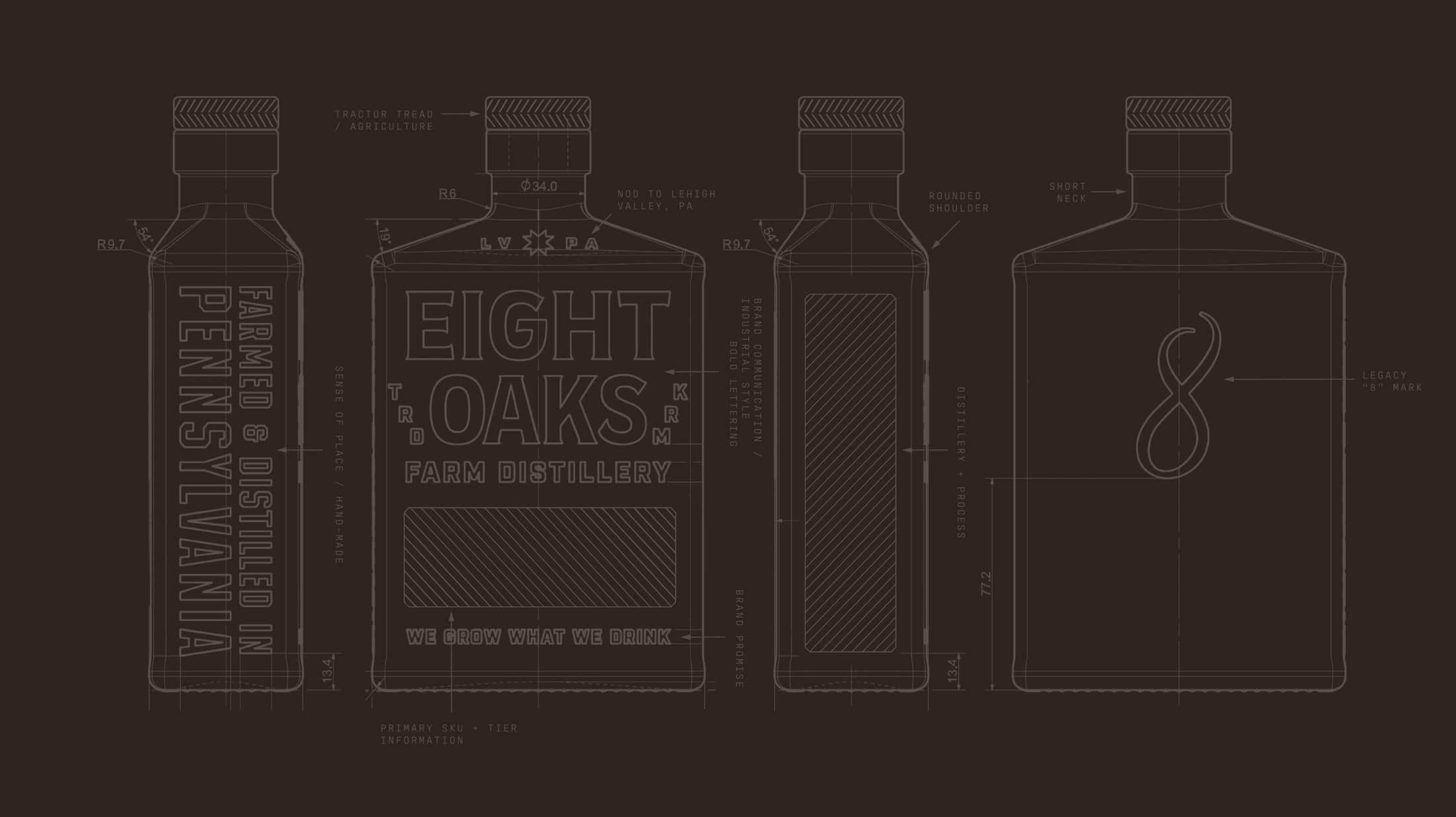
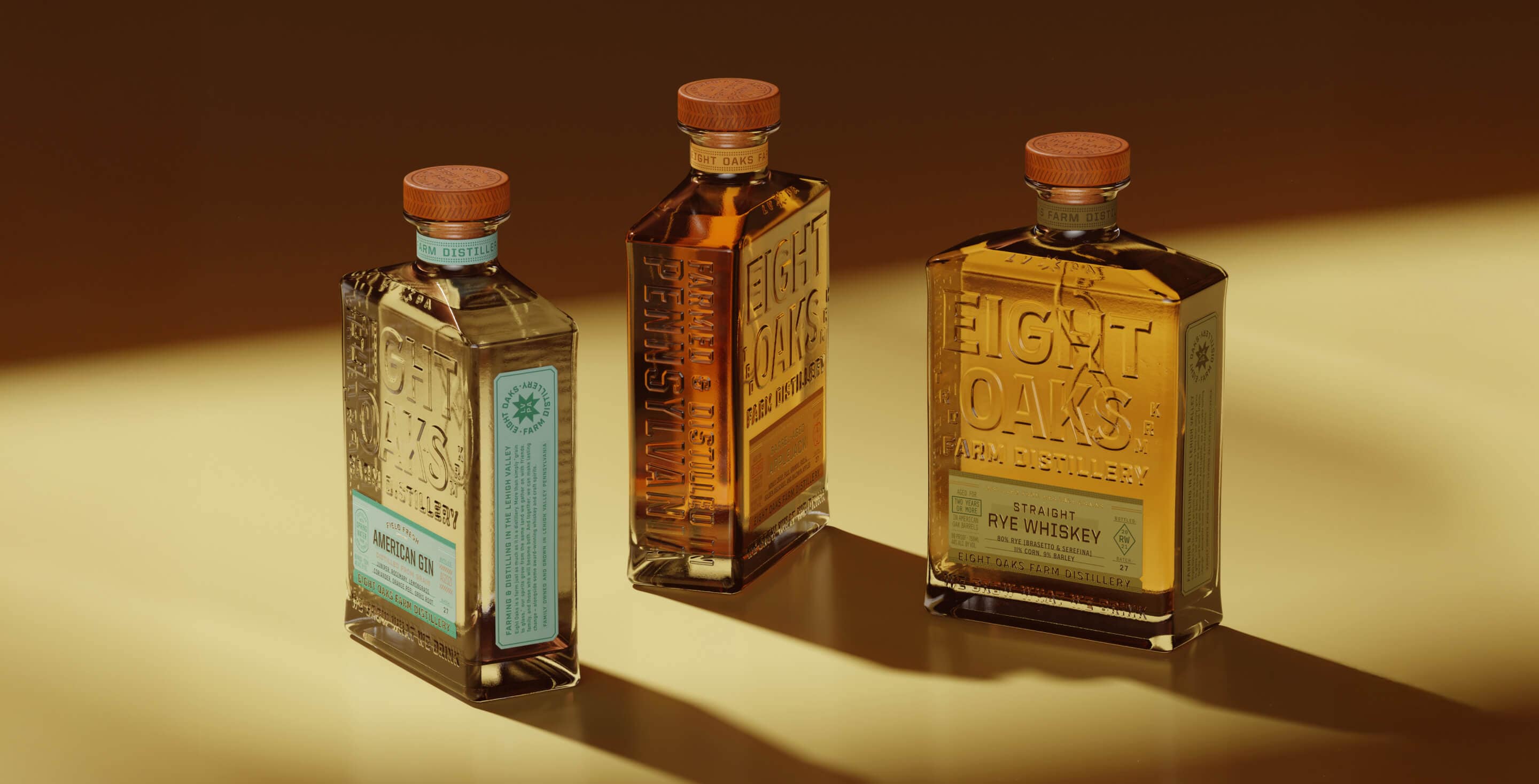
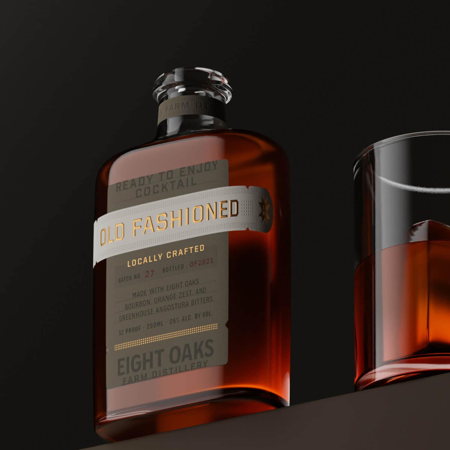
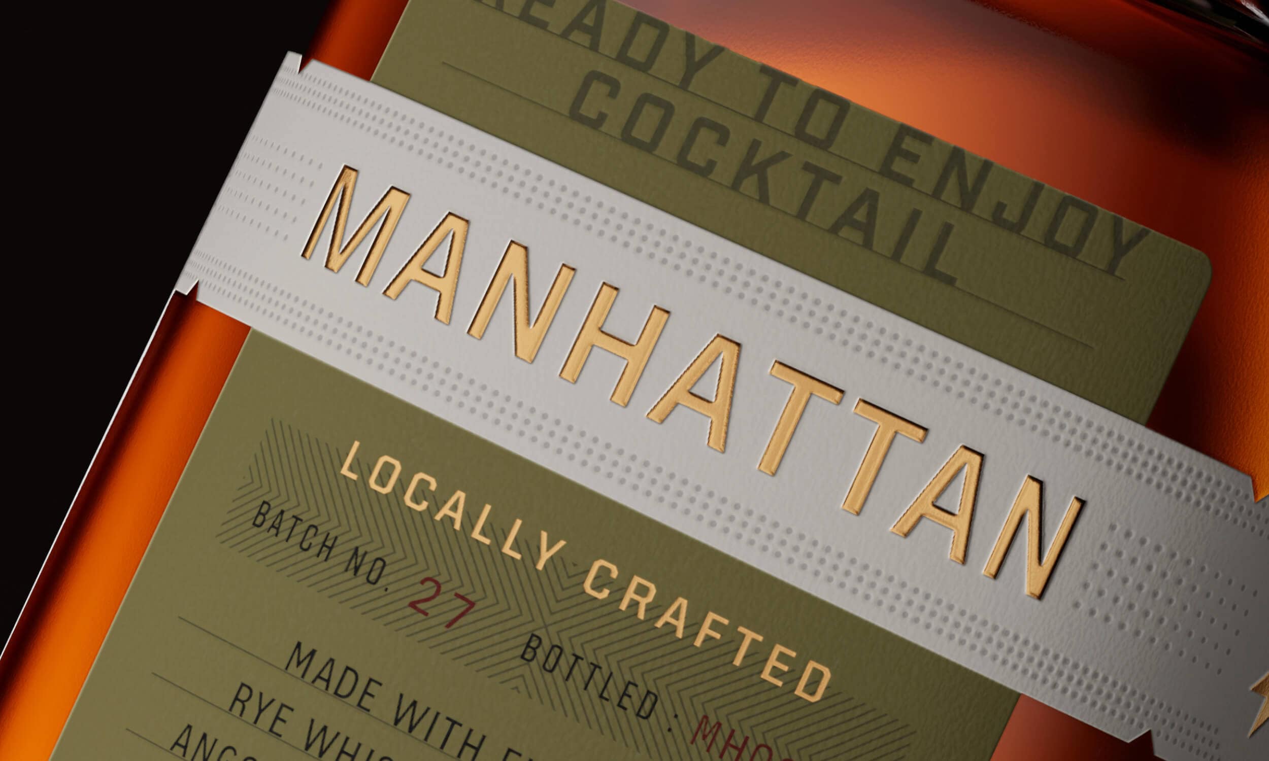
Capturing the nuance of Eight Oaks' story in details large and small, the flask-inspired shape of the glass is a nod to the working-class history of farmers and steelworkers in Pennsylvania. By using the real estate of the glass, we prominently feature the brand and allow for key storytelling elements to differentiate and elevate the package while creating space for the liquid to shine. The glass design accommodates a distinctive label system, where through color, prominent titling, premium print techniques, and a systematic approach, we created a cohesive yet differentiated look across the four product tiers and 15 individual SKUs while setting the brand up for sustainable growth. And finally, the back of the bottle bears the founder’s grandfather’s signature “8,” a tribute to the eight letters in “I love you," honoring family, community, legacy, and a thriving future for Eight Oaks, while celebrating its meaningful past.
Read More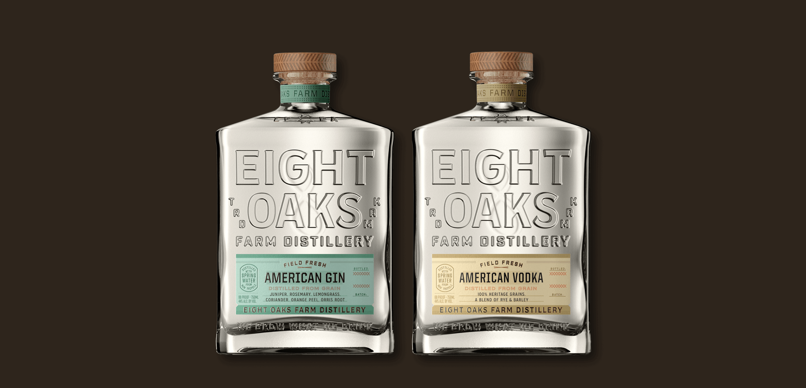
Packaging
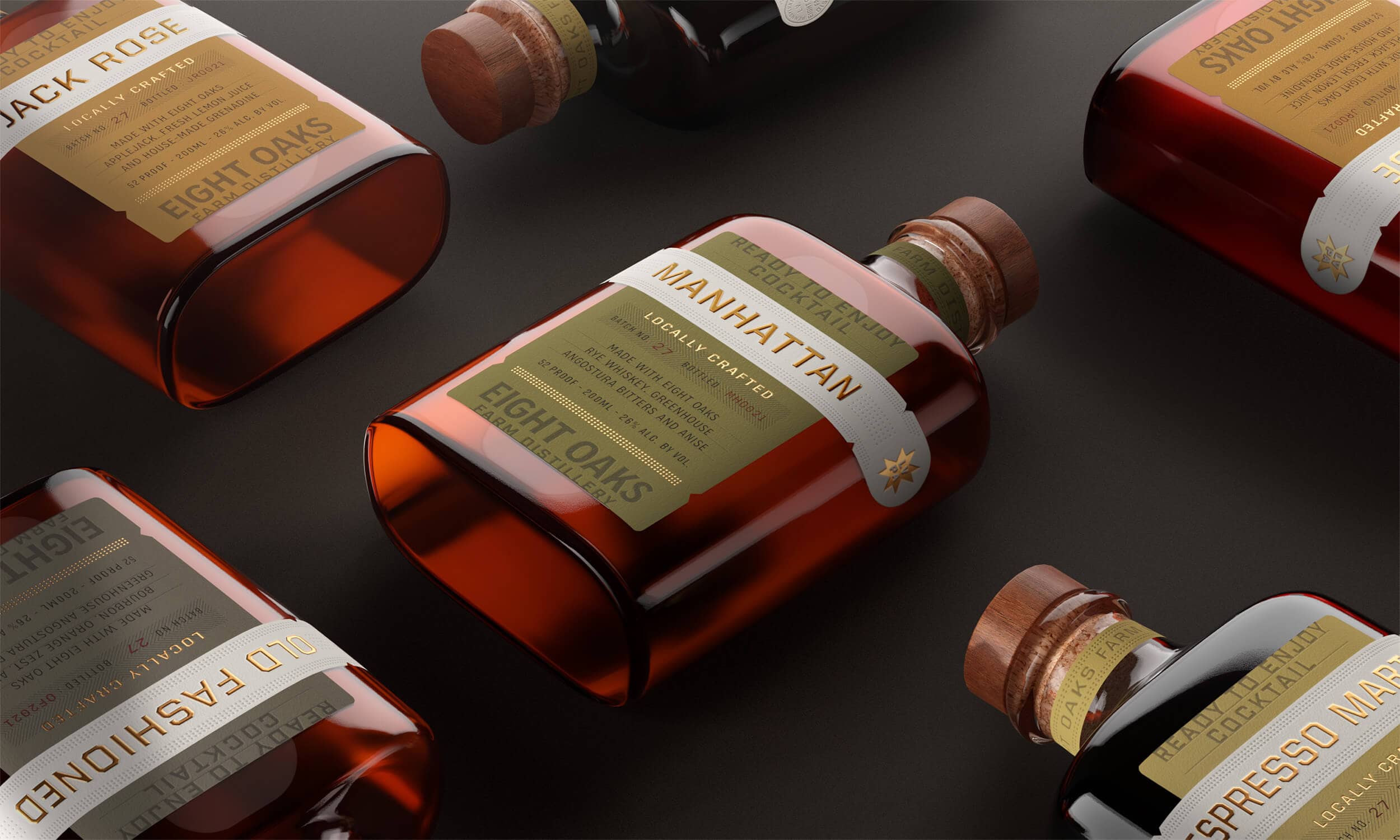
Ready To Drink Cocktails
Eight Oaks’ ready-to-drink craft cocktails are made with the same heritage, regeneratively grown grains as their spirits, mixed with real ingredients from local farms. Our goal was to create a design that resonates with their farming and community-driven ethos, balancing an elevated feel and down to earth aesthetic. The result is pure Eight Oaks: ready for any occasion and accessible to all.
Read More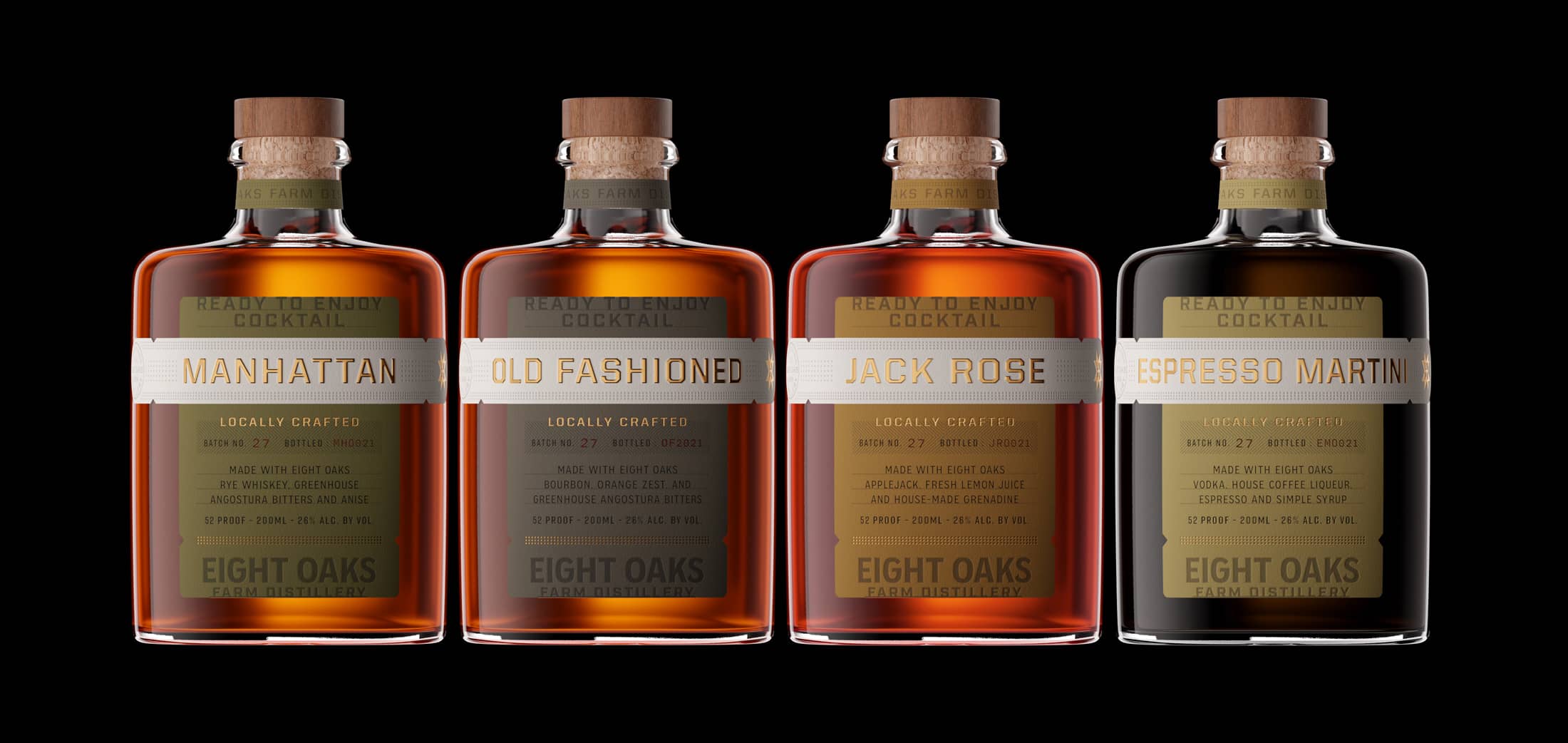
Testimonial
Client Spotlight