Brucato Spirits
Expanding the Spirit of Brucato Amaro
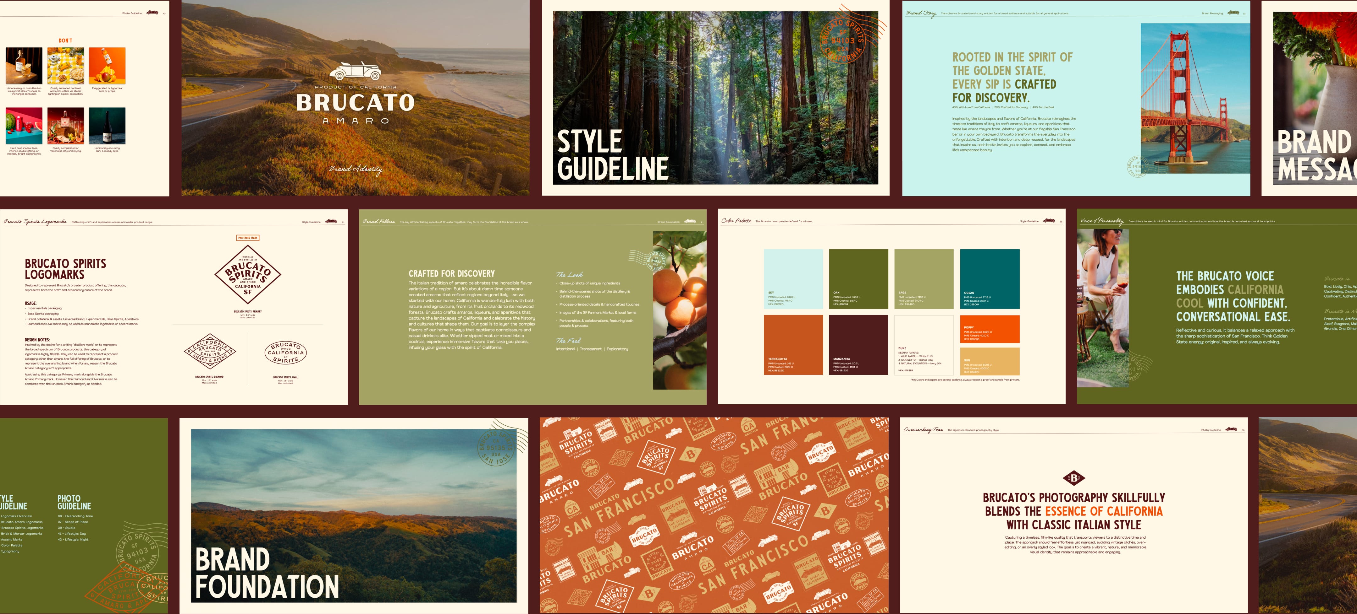
Brucato began with a singular vision: to reimagine the Italian amaro tradition through the vibrant lens of California. With the launch of their new distillery in San Francisco’s Mission District, that vision quickly became reality. The opening generated local acclaim, and drove immediate traction across the Bay Area. Within weeks, Brucato secured multiple new accounts, with bartenders throughout the city adopting their innovative amaros and aperitifs into cocktail programs. Our challenge was to create a cohesive brand system that preserved the equity of the flagship while giving Brucato room to explore, innovate, and expand.
Client
Brucato Spirits
Services
- Branding
- Packaging
Awards & Recognition


Branding
Strategy & Identity
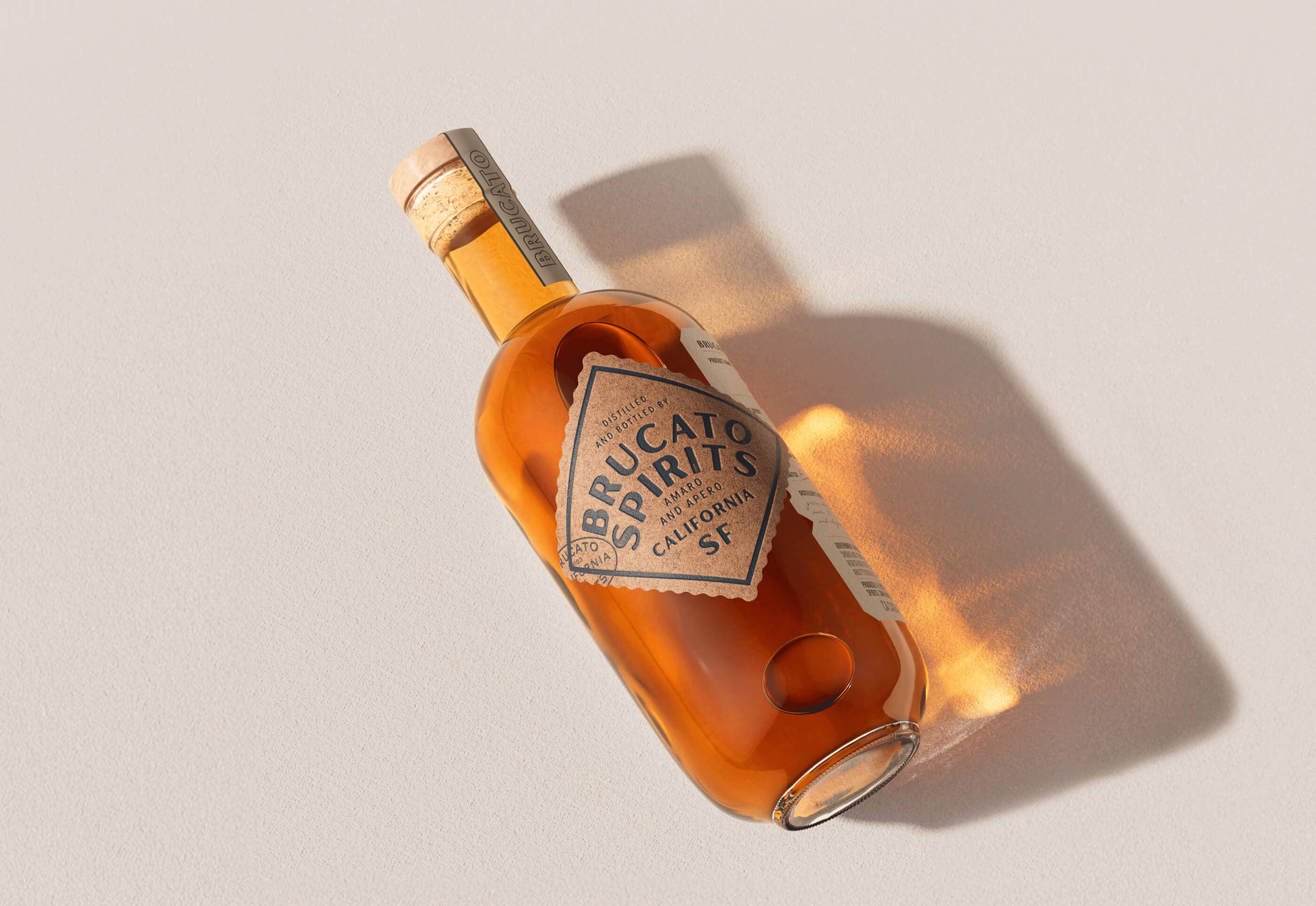
We approached Brucato’s brand world as an adaptive ecosystem that could flex across flagship products, small-batch experimentals, and hospitality touchpoints, yet always feel unmistakably Brucato. Building from their existing Amaro flagship, we created a system of adaptive logomarks, earthy California-inspired color palettes, artisanal typography, and travel-inspired accent marks. These elements work together to tell a story of discovery, craftsmanship, and place, whether on a bottle label, an Instagram post, or a tasting room menu.
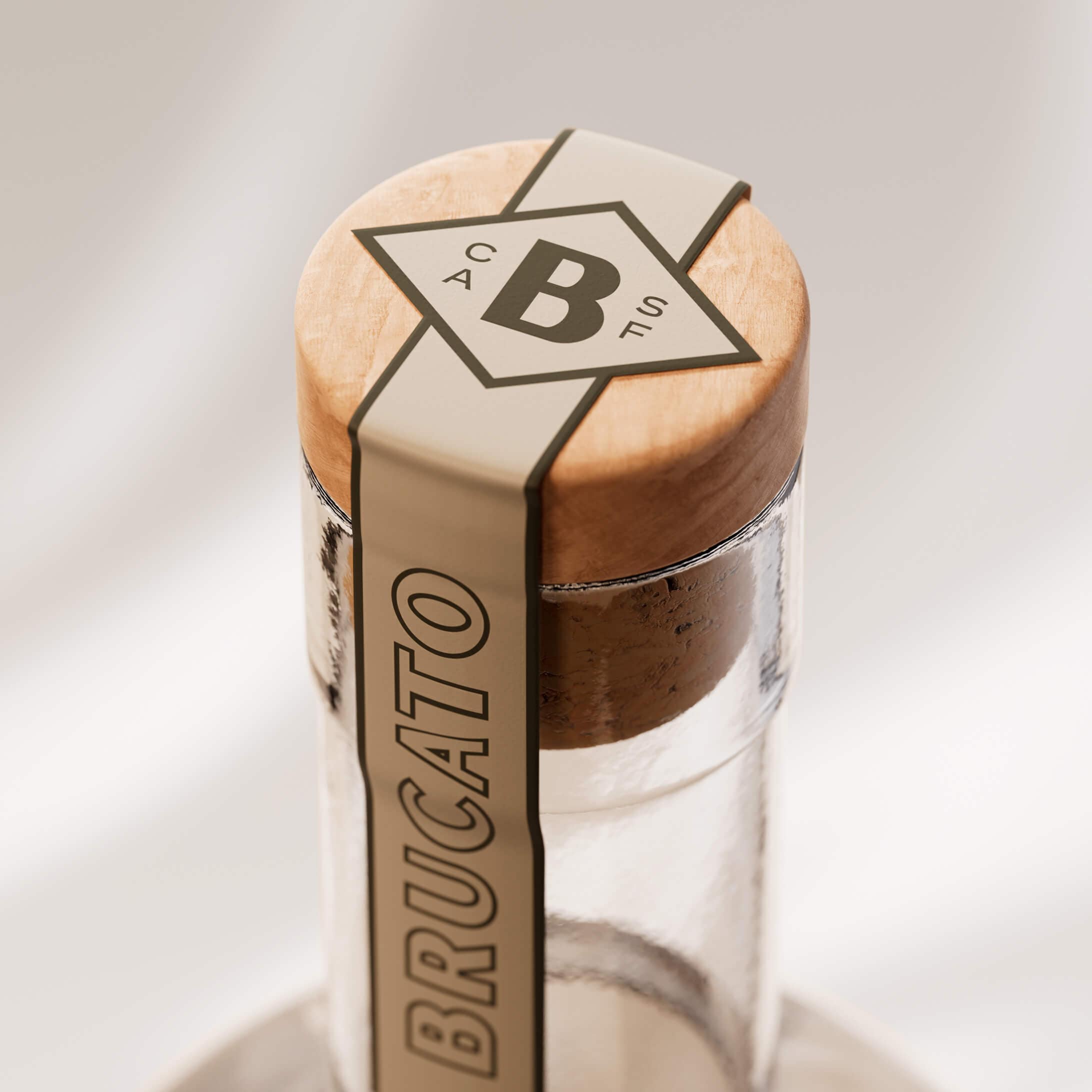
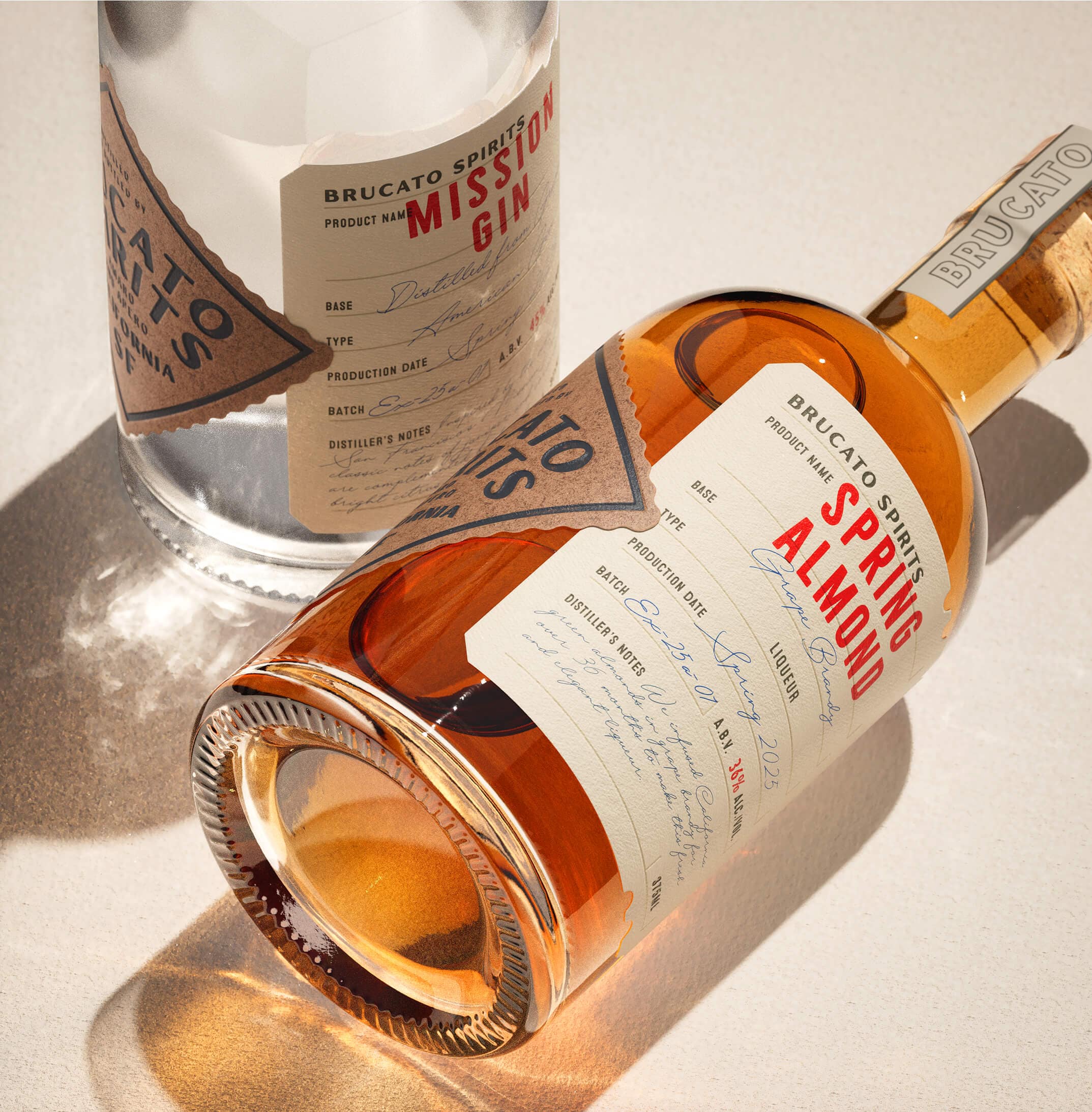
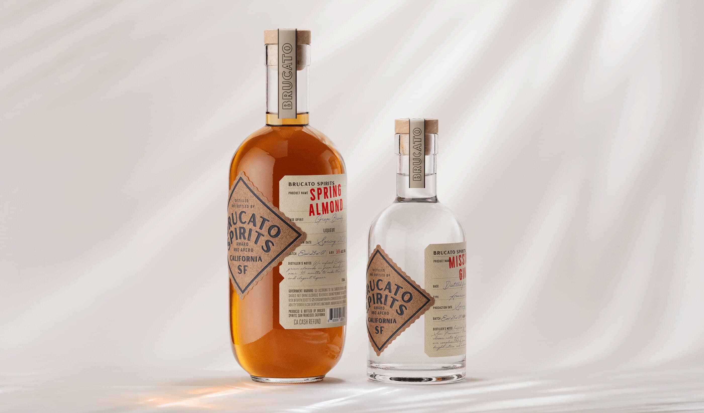
Packaging
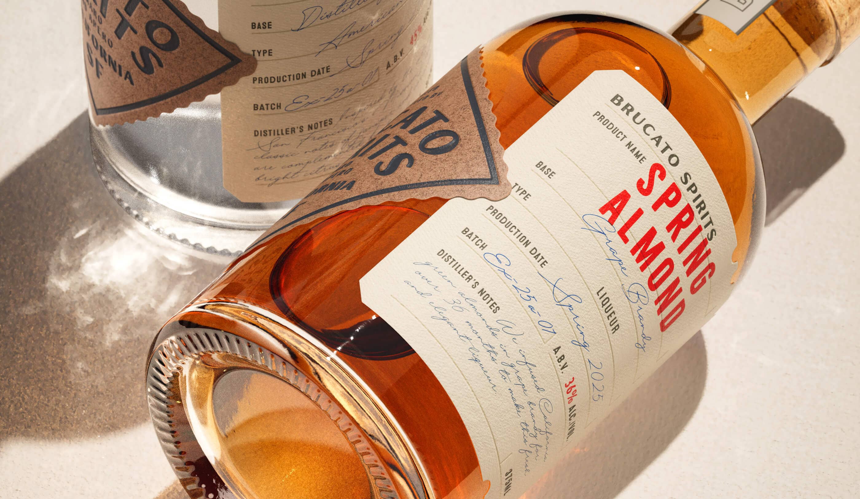
Experimentals
The Experimentals line celebrates the art of exploration. We leaned into a postcard and travel-stamp aesthetic, combining typewriter-style typography with handwritten batch details for a handcrafted feel. A flexible wrap design allows for flavor-specific notes, available in both 750 ml and 375 ml formats, the line was designed with giftable packaging opportunities and distillery exclusives in mind.
Packaging
Reserves
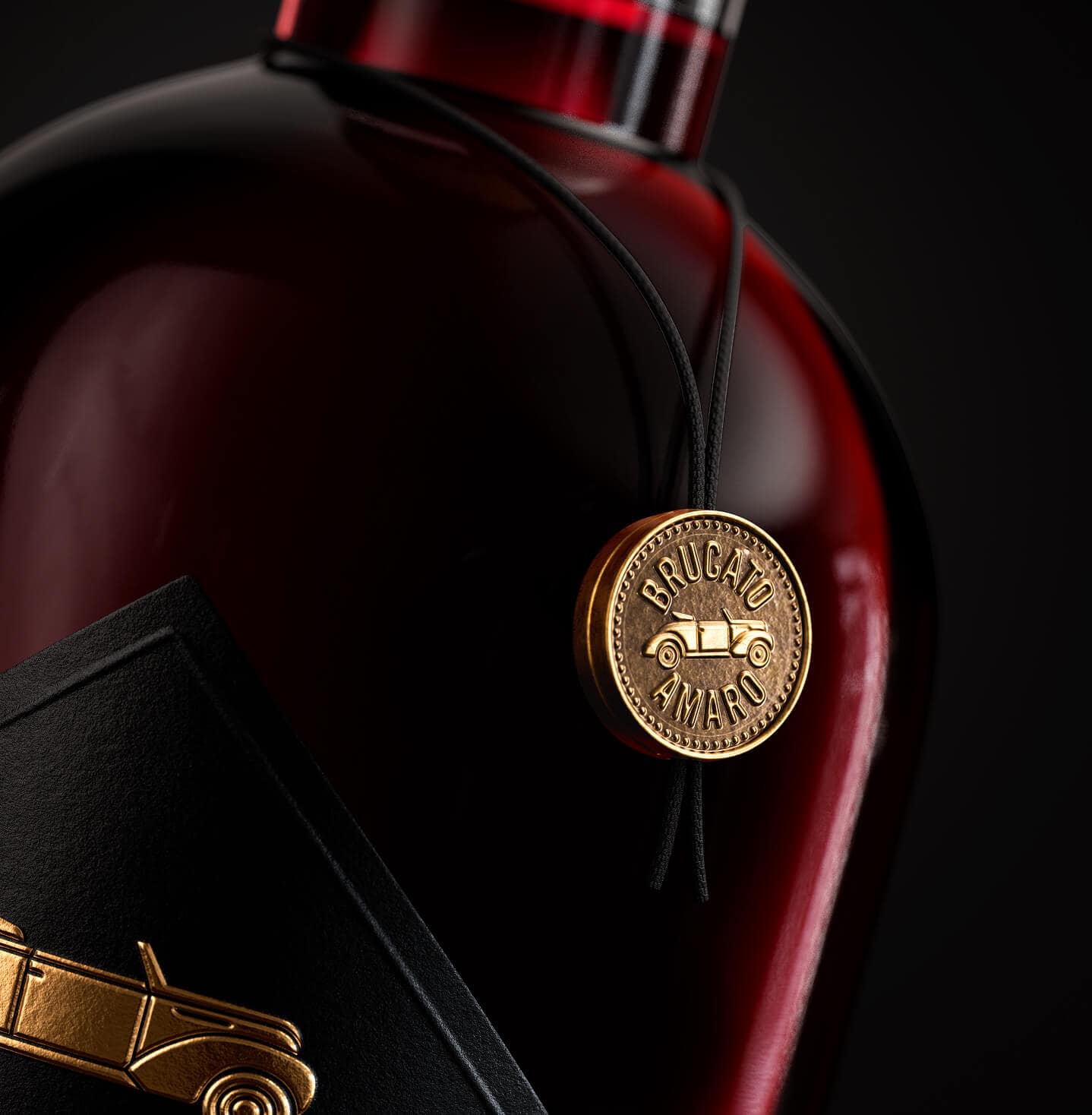
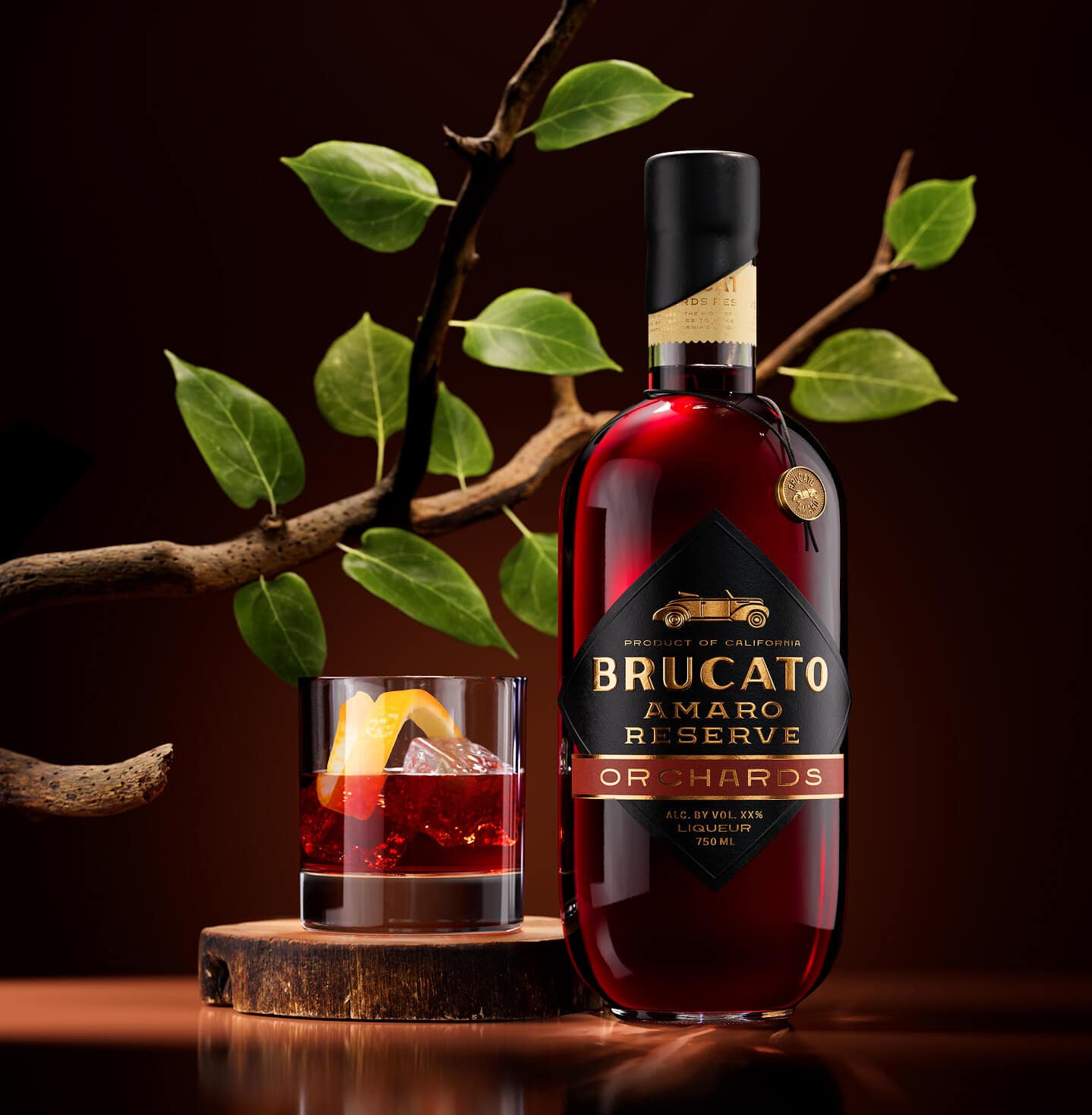
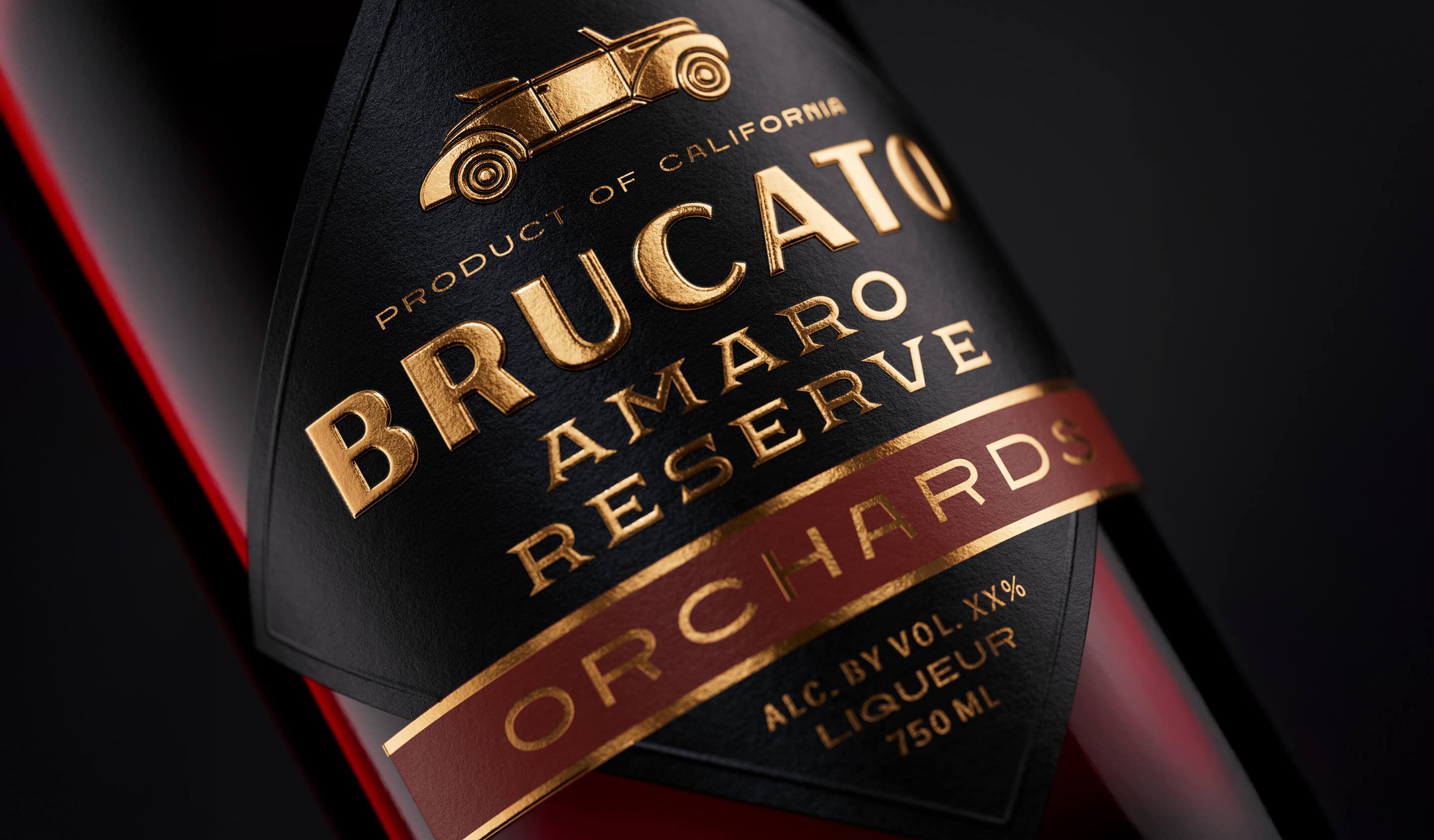
The Brucato Reserves collection elevates the flagship amaro experience with bold, layered flavors aged for depth and complexity. We translated this premium positioning into a travel-inspired and transportive design that features road sign-shaped labels, a custom medallion hang tag, and a wax seal with paper stamp on the neck. Each bottle retains the iconic flagship car illustration, grounding the series in Brucato heritage while signaling its small-production and collectible nature.
Read More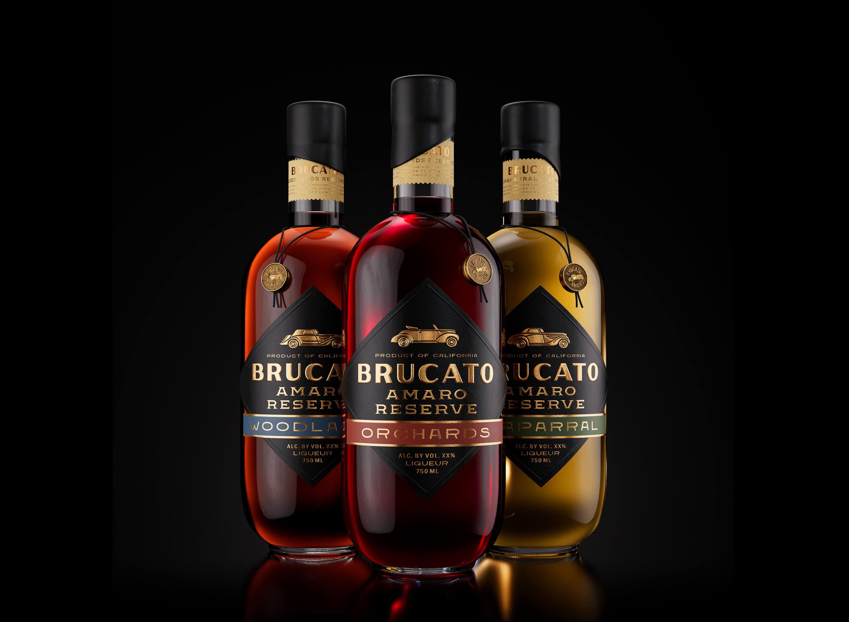
Packaging
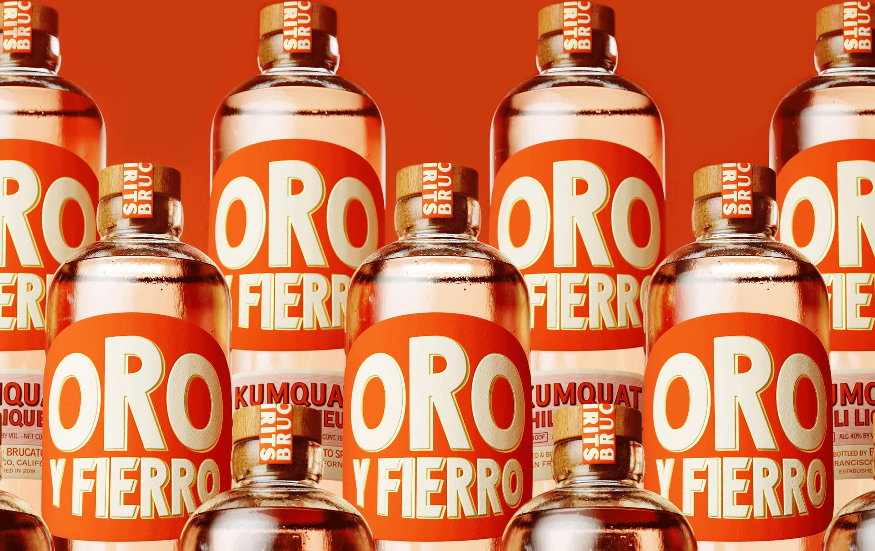
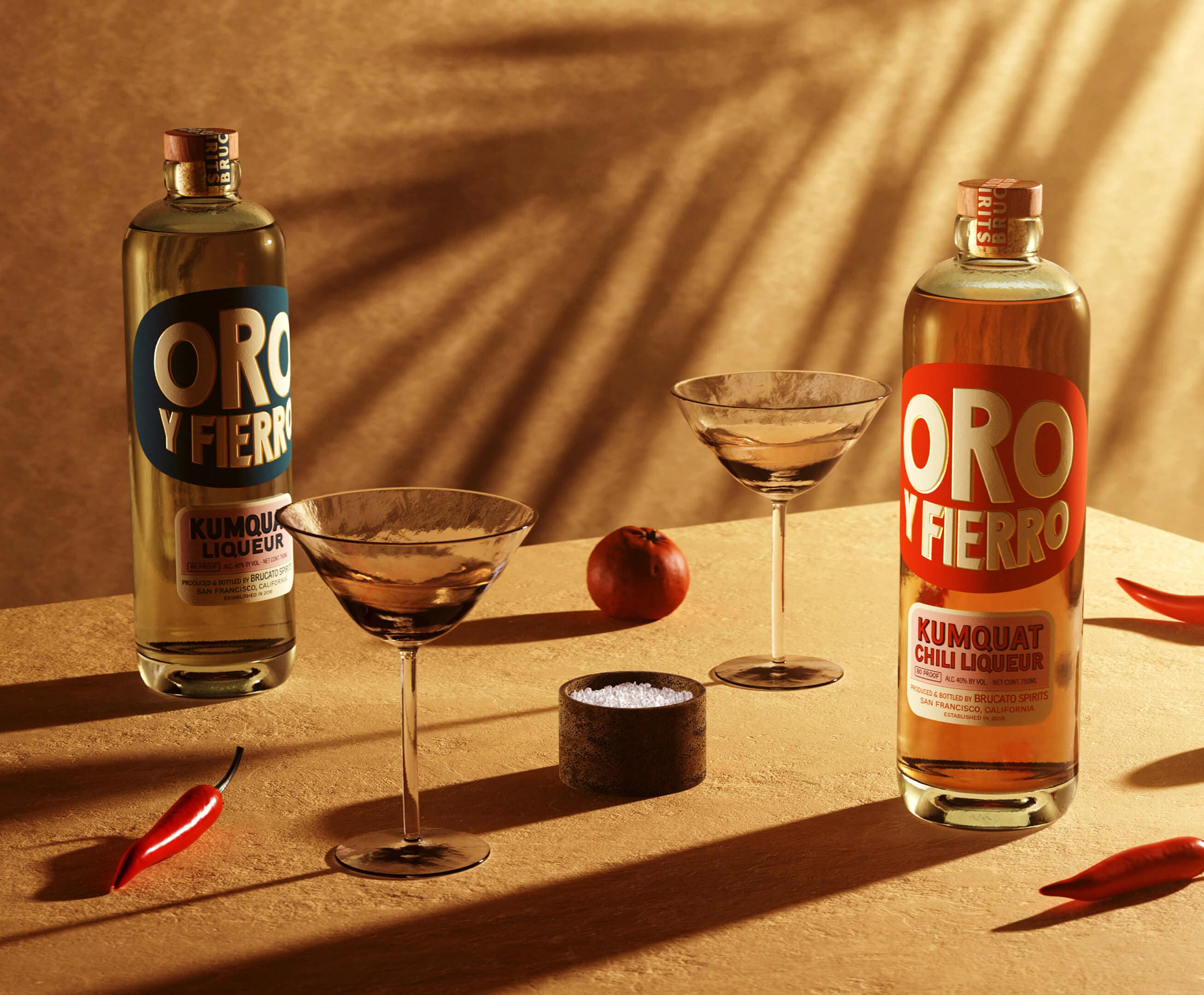
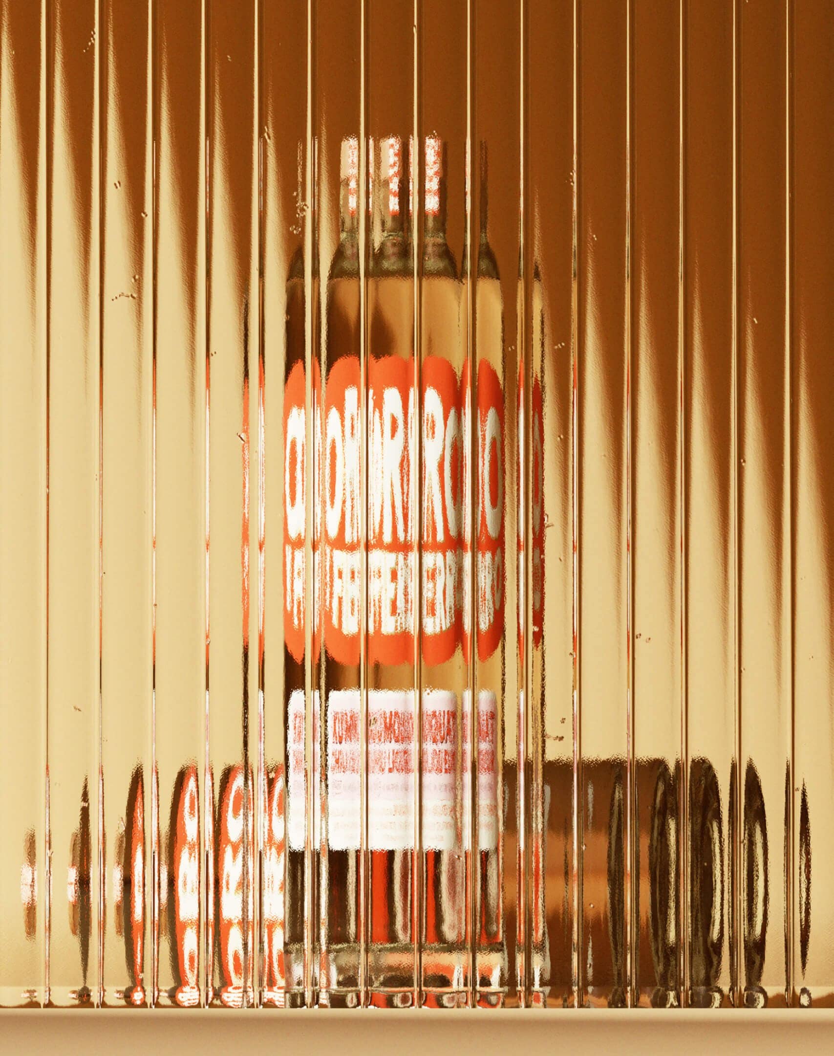
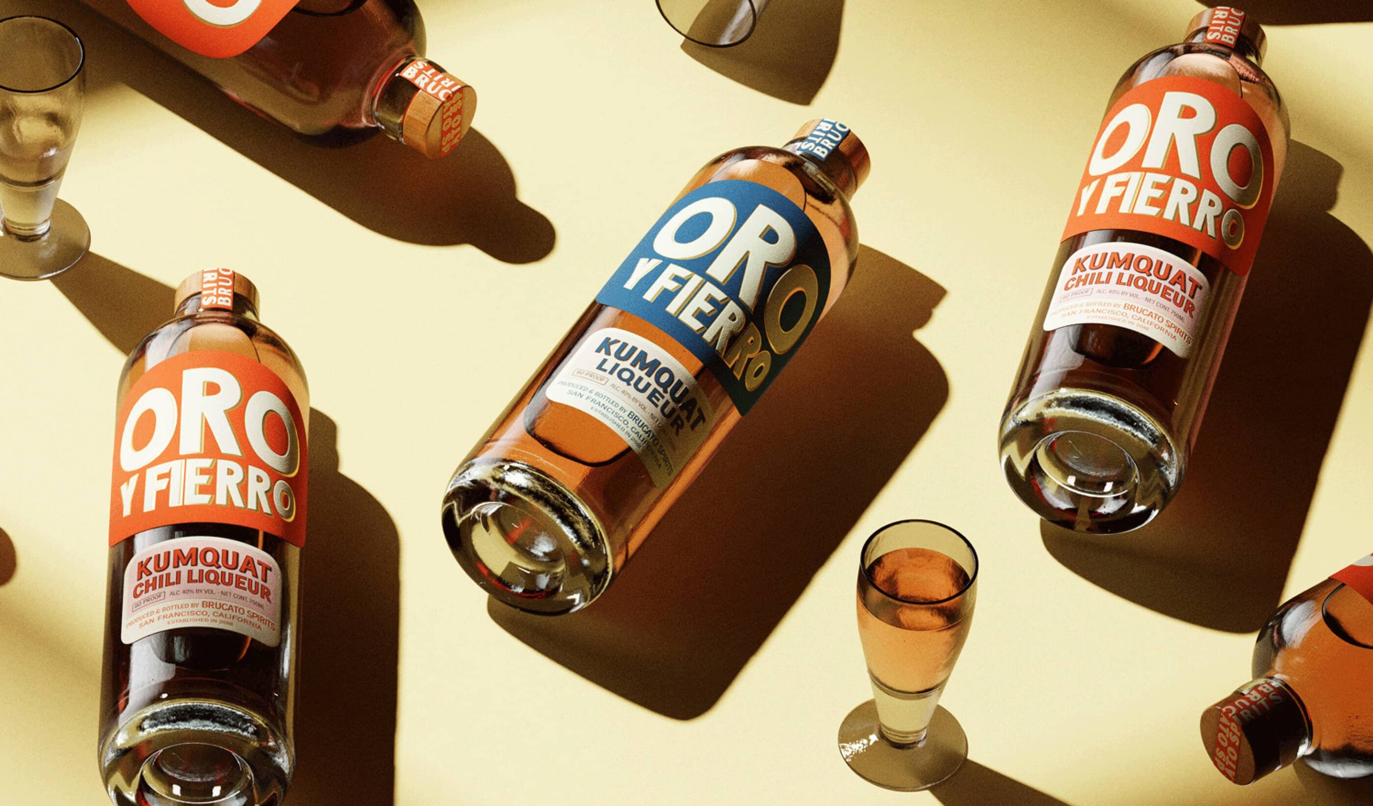
Oro Y Fierro
Oro Y Fierro began as an experimental kumquat liqueur, intended as a vibrant and flavorful alternative to triple sec. Drawing inspiration from the San Francisco flag and vintage tinned-fish packaging, we developed a design that feels playful yet premium. The tinted green glass adds nostalgic depth, while bold typography and foil detailing distinguish the two variants, with gold foil for the chili-infused edition and brass foil for the standard. The result is a striking shelf presence that honors Brucato’s adventurous spirit.